How to Use Colour to Separate Zones in an Open-Plan Indian Home
How smart colour choices can turn one continuous open-plan space into a home that actually feels like it has rooms.
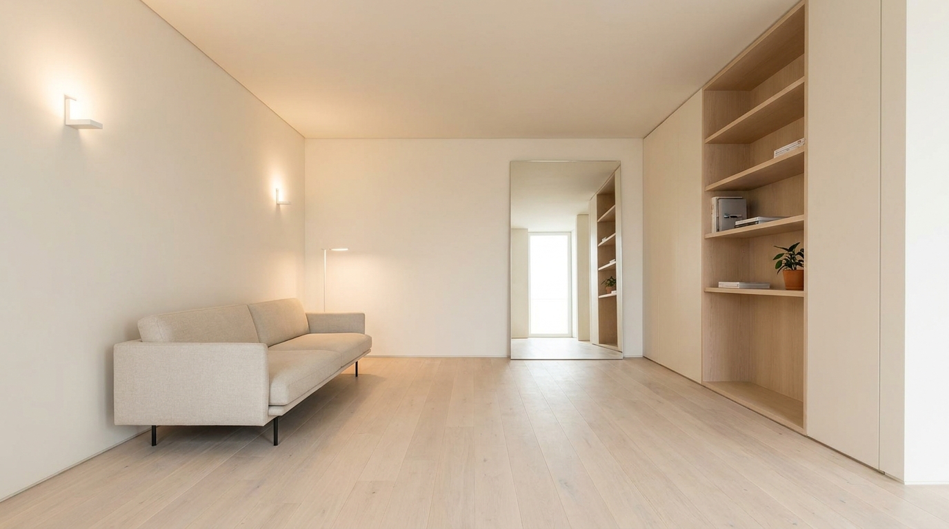
Most new apartments in Delhi NCR come with the same floor plan: one continuous space that's supposed to function as a living room, a dining area, and sometimes a study or work corner all without a single wall dividing them. The result looks spacious on the brochure and feels undefined in real life. Furniture alone rarely solves it. The zones blur into each other, and the space ends up feeling neither cohesive nor purposeful.
Colour zoning is how designers solve this without building walls. The principle is simple assign each zone a distinct but related colour treatment, and the eye reads them as separate spaces even though the floor is continuous. Done well, it makes an open-plan apartment feel like a home with rooms, not just a single large room with furniture in it.
Here are five colour zoning approaches that actually work in Indian open-plan apartments.
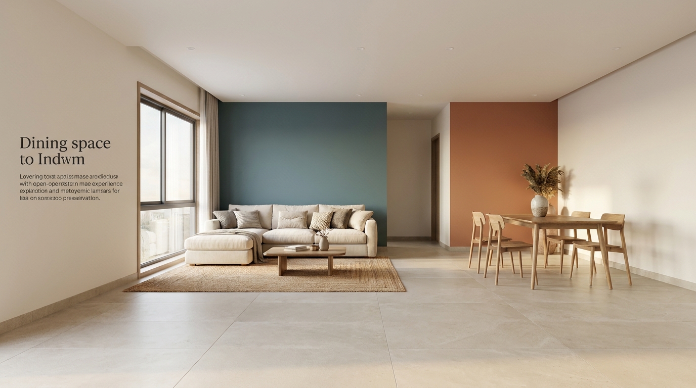
1. The Anchor Wall Method — One Bold Colour Per Zone
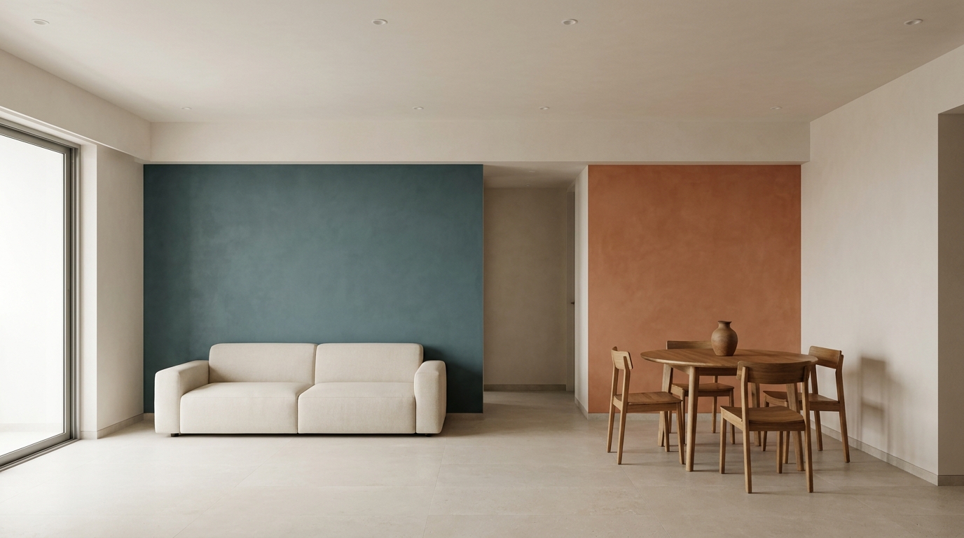
The simplest form of colour zoning: each zone gets one wall painted in a distinct colour, with the remaining walls staying neutral throughout. The bold wall acts as a visual anchor that tells the eye "this zone starts here."
For a living-dining open plan: a deep dusty teal anchor wall behind the sofa, and a warm terracotta anchor wall behind the dining table. The floor, ceiling, and all other walls stay in one continuous warm white. The two zones read as distinct without any physical separation the colour does the dividing.
The rule: anchor colours must share the same tonal temperature (both warm or both cool-leaning) so the overall space still reads as one considered home rather than two unrelated rooms.
2. The Ceiling Colour Drop — Zone from Above, Not the Sides
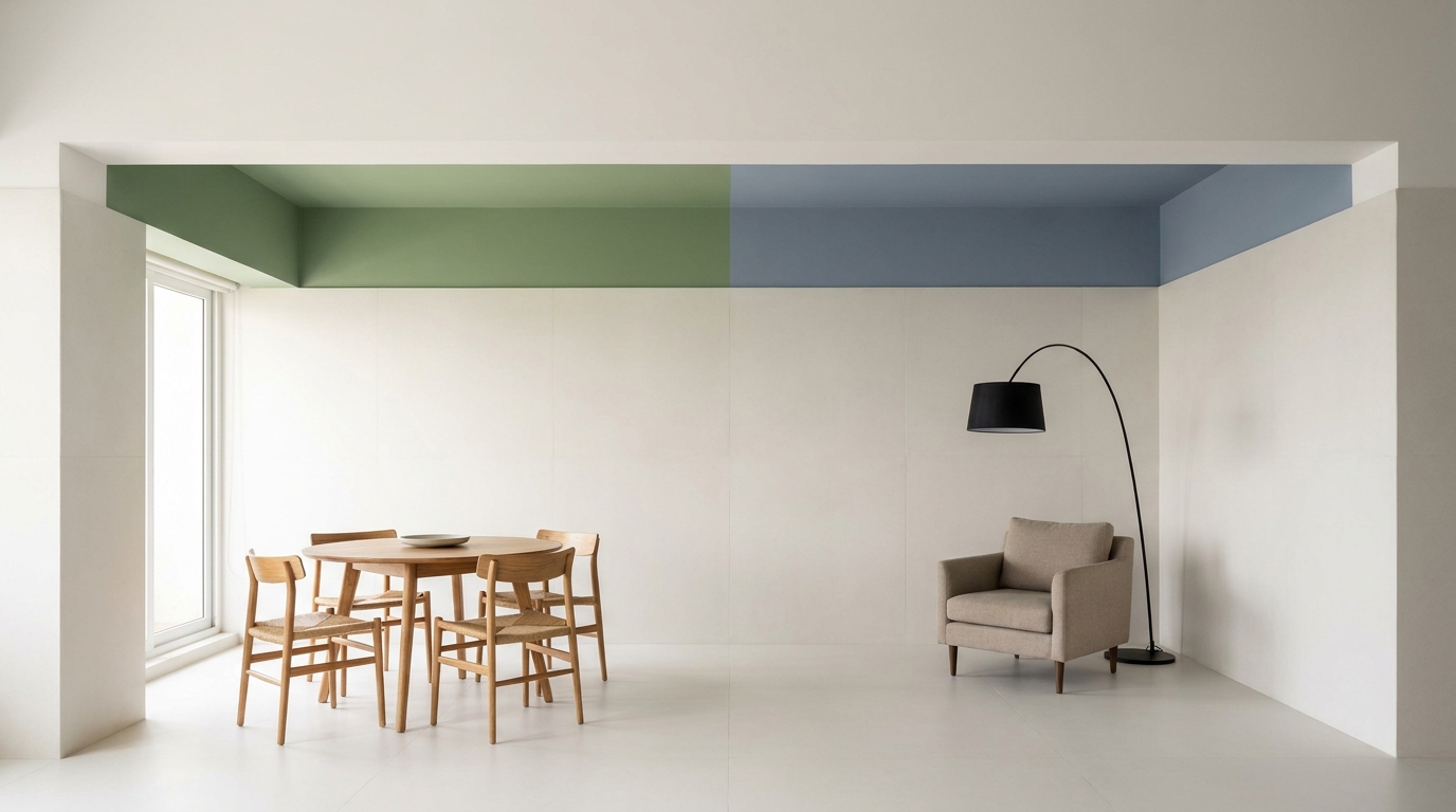
An underused technique in Indian homes: paint the ceiling above each zone a different colour instead of the walls. In a space where all four walls need to stay neutral (small apartment, resale concerns, landlord restrictions), ceiling colour is the only surface that changes.
A warm sage ceiling above the dining table and a soft slate blue above the reading corner both on a white-walled, continuous floor plan create a remarkably strong sense of separate zones. The eye reads the coloured ceiling as a visual "room within a room" even without walls.
This also works exceptionally well with Indian ceiling heights, which in newer apartments tend to be lower than older construction the colour draws attention upward and makes the ceiling feel intentional rather than just a white afterthought.
3. The Half-Wall Colour Split — Dado Height Colour Change
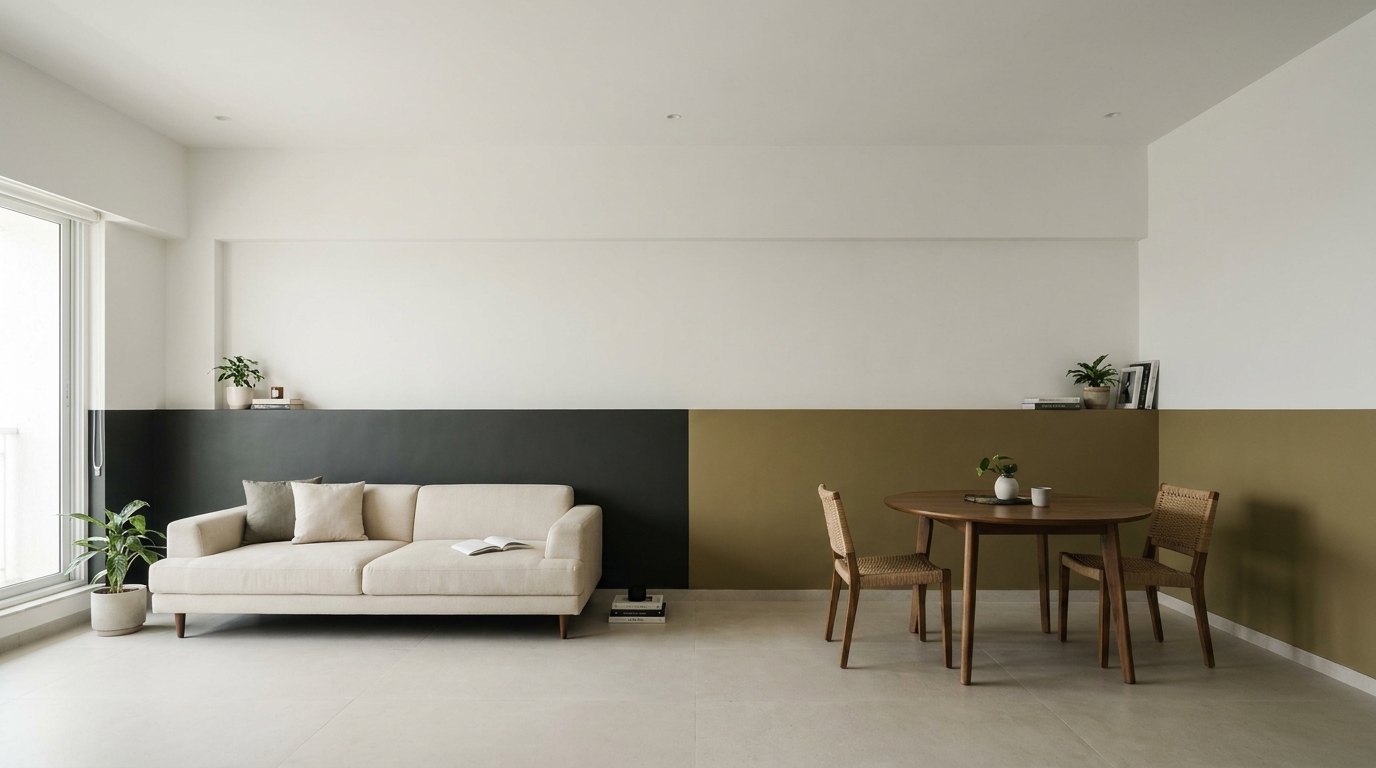
A dado-height colour treatment (colour applied from the floor up to roughly 90cm–1m, neutral above) assigns each zone a distinct lower-wall colour while the upper wall and ceiling remain the same neutral throughout.
For a living-dining split: deep charcoal dado in the living zone, warm olive dado in the dining zone, both topped with the same chalk white upper wall. The continuous neutral above unifies the space; the distinct dado colours below define each zone clearly.
This is particularly effective in Indian homes because it grounds furniture visually a sofa sitting against a charcoal dado looks intentionally placed rather than floating against a plain white wall and it's far easier to repaint a dado than a full wall if preferences change.
4. The Material Colour Zone — Let Surfaces Do the Separating
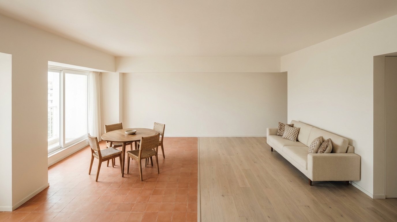
Instead of paint, use distinct material colours to define zones: a warm terracotta Moroccan tile floor in the dining zone transitions to pale oak wood flooring in the living zone, with no paint colour change on any wall. The flooring material itself draws the zone boundary.
This works best in apartments where the developer has already tiled the entire space in one neutral a contrasting material zone can be introduced as a floating platform or a defined material inlay rather than a full refit. It's also the most permanent and architecturally considered form of colour zoning, and the one that adds the most resale value.
The key is keeping the material colour transition clean and deliberate a clear edge between zones, not a gradient so the boundary reads as a design decision rather than an unfinished floor.
5. The Furniture Colour Block — No Paint, All Upholstery
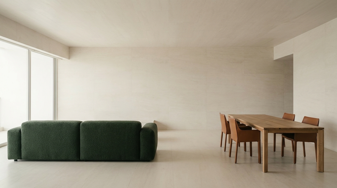
The most renter-friendly approach: use large furniture pieces in distinct zone colours to create the separation without touching a single wall. A deep forest green sofa defines the living zone; a set of cognac leather dining chairs defines the dining zone. Both sit on a neutral floor against neutral walls.
The furniture colour becomes the zone marker the eye reads "green sofa area" and "cognac chairs area" as distinct zones even in a completely continuous, identically finished space. It requires more commitment to bold furniture choices than most Indian homeowners are used to, but it's the only colour zoning method that's fully reversible and requires zero construction or painting.
A well-zoned open-plan space doesn't need walls it needs colour decisions made with intention. That sequencing, knowing which zone gets which treatment and how the transitions between them are handled, is exactly the kind of planning our verified designers map out before a single tin of paint is opened.
Want your open-plan space properly zoned? Book a free home visit with a HeyBuddy verified designer and get a colour plan built around your apartment's actual layout.
Want a real estimate for your home?
Share your home in 2 minutes. We'll match you with verified designers in your city and give you a BOQ-level estimate before any work begins.
Share your home →