6 Modern Colour Combinations Indian Homes Haven't Tried Yet
Six fresh, designer-approved colour combinations that move beyond beige and actually work in Indian homes.
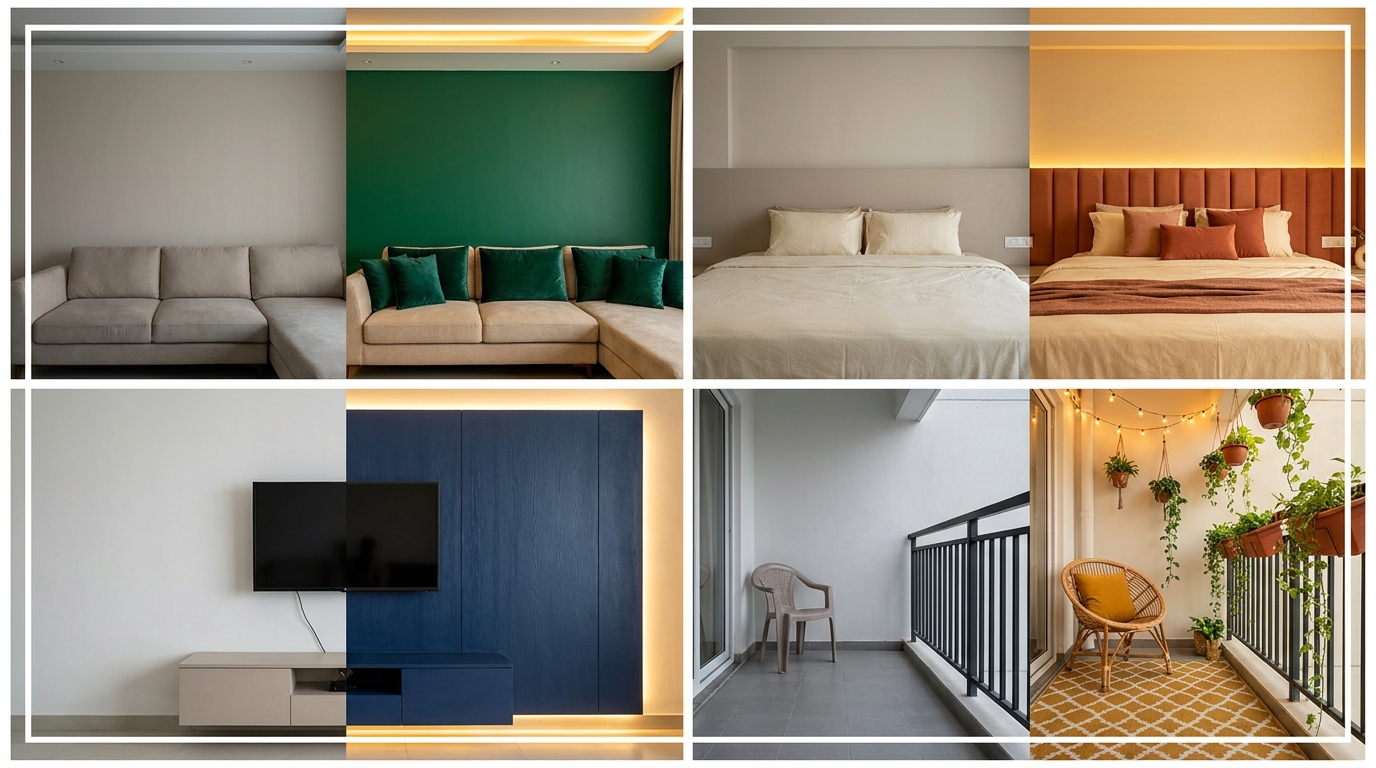
Most Indian homes default to one of two colour modes safe beige and white, or the increasingly overdone navy-and-gold look. Both are fine. Neither is particularly interesting anymore. The good news: there's a wide middle ground of modern colour combinations that feel genuinely fresh, work in real Indian homes with real Indian light conditions, and don't require a complete gut renovation to pull off.
Here are six combinations our verified designers are actually specifying in 2026 none of which you've likely seen in every second Instagram reel.
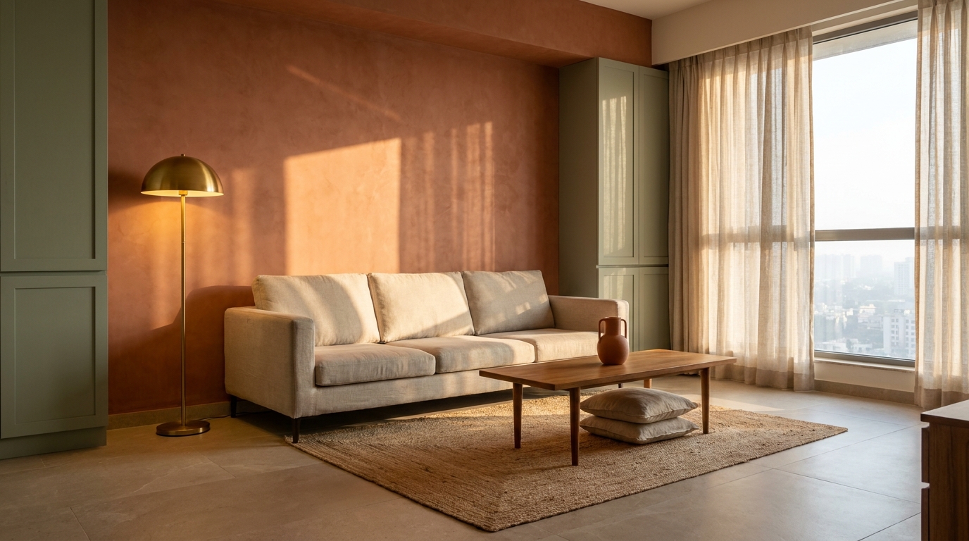
Terracotta + Dusty Sage + Raw Linen
The mood: Warm Mediterranean calm lived-in but considered.
Terracotta and sage sit on opposite ends of the warm-cool spectrum but share the same muted, earthy undertone, which is exactly what makes them work together without competing. The raw linen acts as the neutral thread — not white, which would be too stark, and not cream, which tends to push the whole palette warmer than it should be.
This combination works especially well in rooms that get afternoon western sun, where the warmth of terracotta reads rich rather than orange. Apply it as: terracotta on one wall (not all four), sage on woodwork and cabinet fronts, linen for upholstery and curtains.
Where it works best: Living rooms, bedrooms, puja spaces.
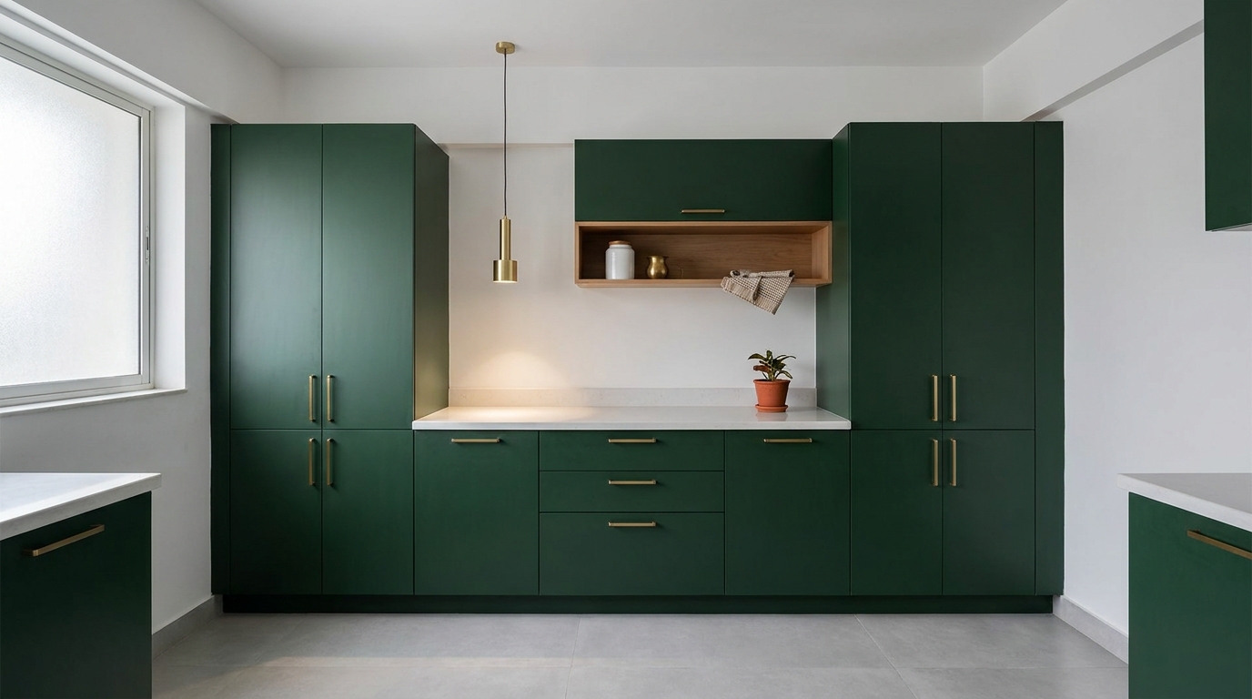
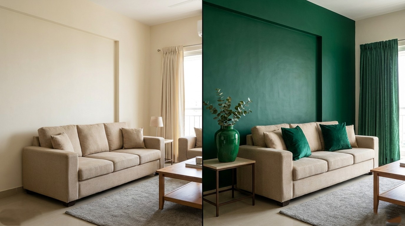
Forest Green + Warm Brass + Chalk White
The mood: Contemporary and grounded confident without being loud.
Deep forest green (not olive, not emerald specifically the dark, cool-leaning forest shade) with warm brass accents has been a staple of London and Scandinavian design for a few years, and it translates remarkably well to Indian interiors because the green reads jewel-toned in low light and lush in bright light. Chalk white keeps it from feeling too dark in smaller rooms.
The key is restraint on the brass handles, a light fixture, one or two accessories. Brass used too broadly tips this combination into a tired look fast. The green does the heavy lifting; brass is punctuation, not the sentence.
Where it works best: Kitchens, studies, master bedrooms.

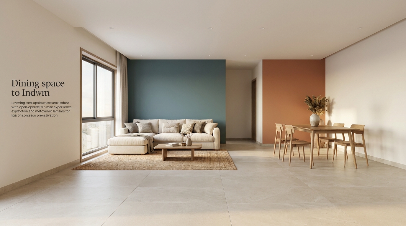
Slate Blue + Burnt Orange + Warm Grey
The mood: Bold contrast done quietly modern without being aggressive.
Slate blue and burnt orange are direct complements on the colour wheel, which means they create natural visual tension — but in their muted, desaturated forms, that tension reads as sophistication rather than conflict. Warm grey mediates between the two, preventing either from dominating.
This is a combination that rewards going darker than instinct suggests. A pale slate blue and a pale burnt orange together look washed out. Both need to carry enough saturation to hold the contrast, with warm grey acting as the breath between them.
Where it works best: Living rooms, dining areas, home offices.
Mushroom + Soft Black + Warm Rattan
The mood: Wabi-sabi minimalism imperfect, tactile, quietly beautiful.
Mushroom (a warm grey-beige with slight pink or taupe undertone) paired with soft black (not harsh matte black a slightly warm-toned almost-black) creates a palette that feels modern without being cold. Rattan as a material note not a colour, but a texture breaks up what might otherwise feel too flat and graphic.
This combination works particularly well in homes leaning toward a Muji or Japanese-Scandinavian aesthetic, and it's more forgiving in variable Indian light than cooler grey palettes that can shift to looking grimy in certain natural light conditions.
Where it works best: Bedrooms, reading nooks, balcony spaces.
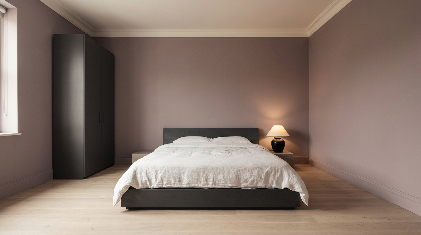
Dusty Mauve + Charcoal + Warm White
The mood: Refined and calm feminine without being pink.
Dusty mauve a grey-leaning, desaturated rose is the grown-up answer to blush pink, and it avoids every association that makes blush feel overdone. Paired with charcoal (for grounding) and warm white (for relief), the result is a palette that feels edited and adult, the kind of room that reads immediately as designed rather than decorated.
This works best when mauve is used on the walls and charcoal is kept to furniture and architectural details flipped, with charcoal walls and mauve accents, it risks feeling heavy in smaller rooms.
Where it works best: Bedrooms, dressing areas, compact living rooms.
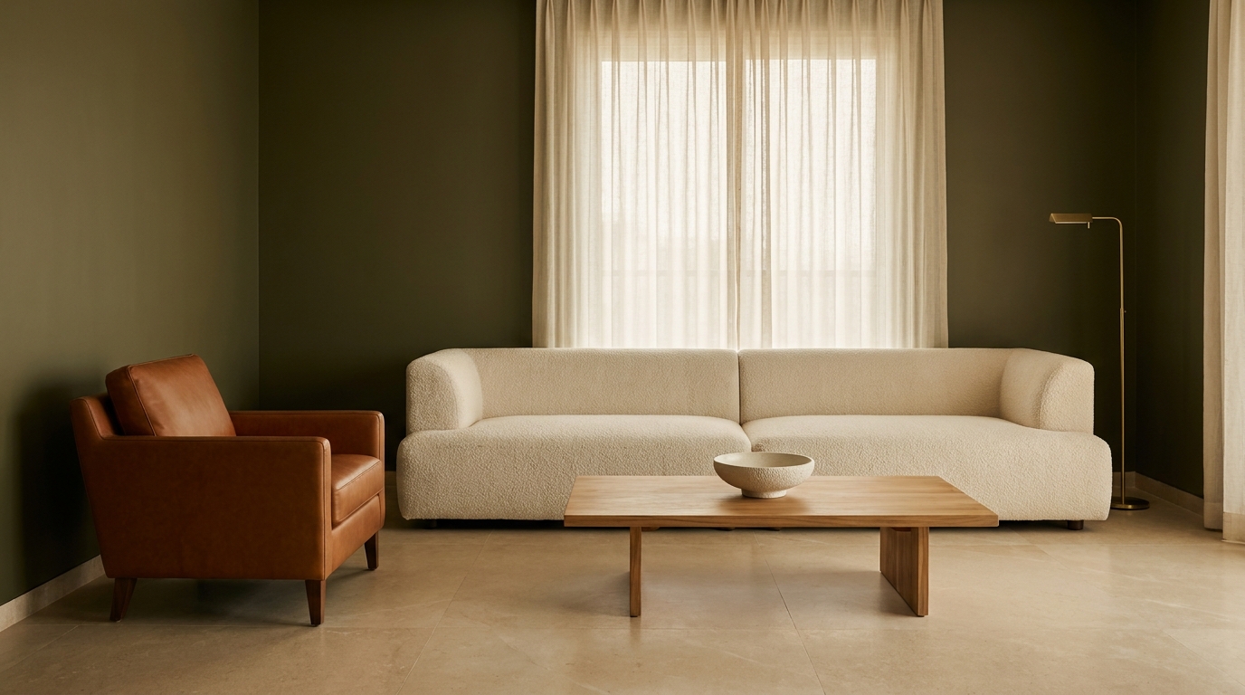
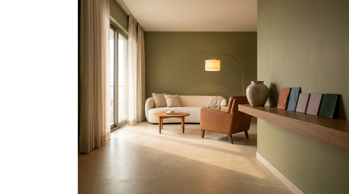
Olive Green + Cognac + Cream
The mood: Italian modern warm, layered, unhurried.
Olive green (yellow-green leaning, not grey-green) with cognac leather and a creamy off-white is a combination that draws from Italian and Portuguese interior design warm climates, warm tones, rich materiality. In Indian homes, it translates naturally because the warmth of the palette complements Indian skin tones and natural light beautifully.
Cognac works best as a material leather upholstery, a woven bag hung on a hook, a wooden edge with warm amber stain rather than as a wall or large-surface colour. Olive takes the walls or cabinetry, cream provides the base, cognac appears as accent and texture.
Where it works best: Living rooms, dining spaces, kitchens.
Want a real estimate for your home?
Share your home in 2 minutes. We'll match you with verified designers in your city and give you a BOQ-level estimate before any work begins.
Share your home →