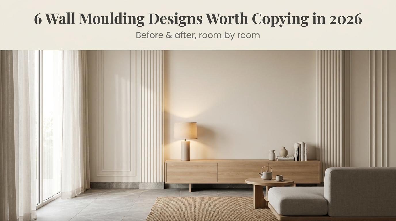
6 Wall Moulding Designs That Change a Room
Six moulding styles, one wall each see exactly what changes when trim does the work paint alone can't.
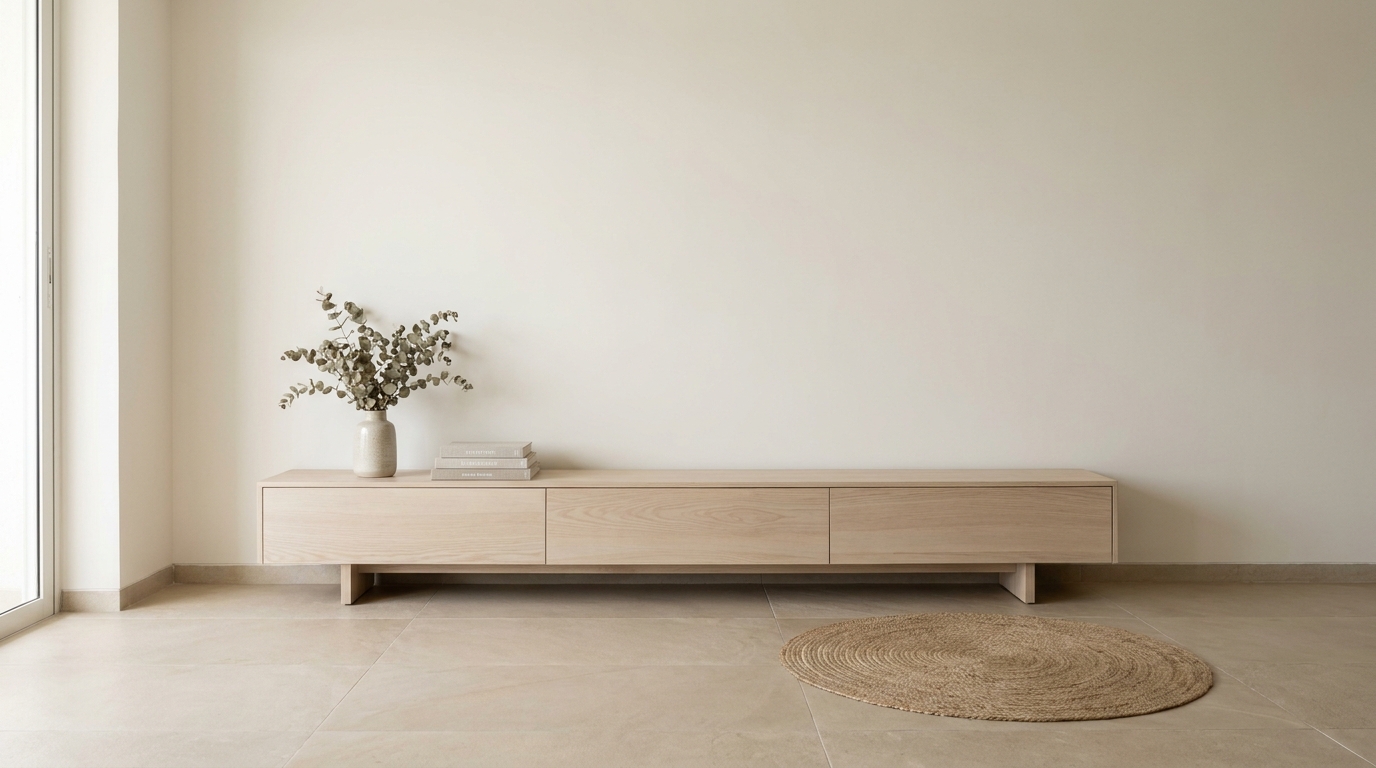
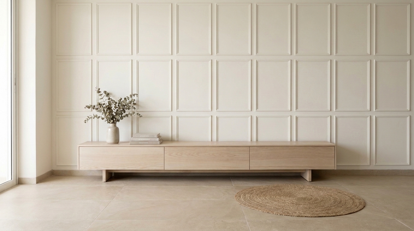
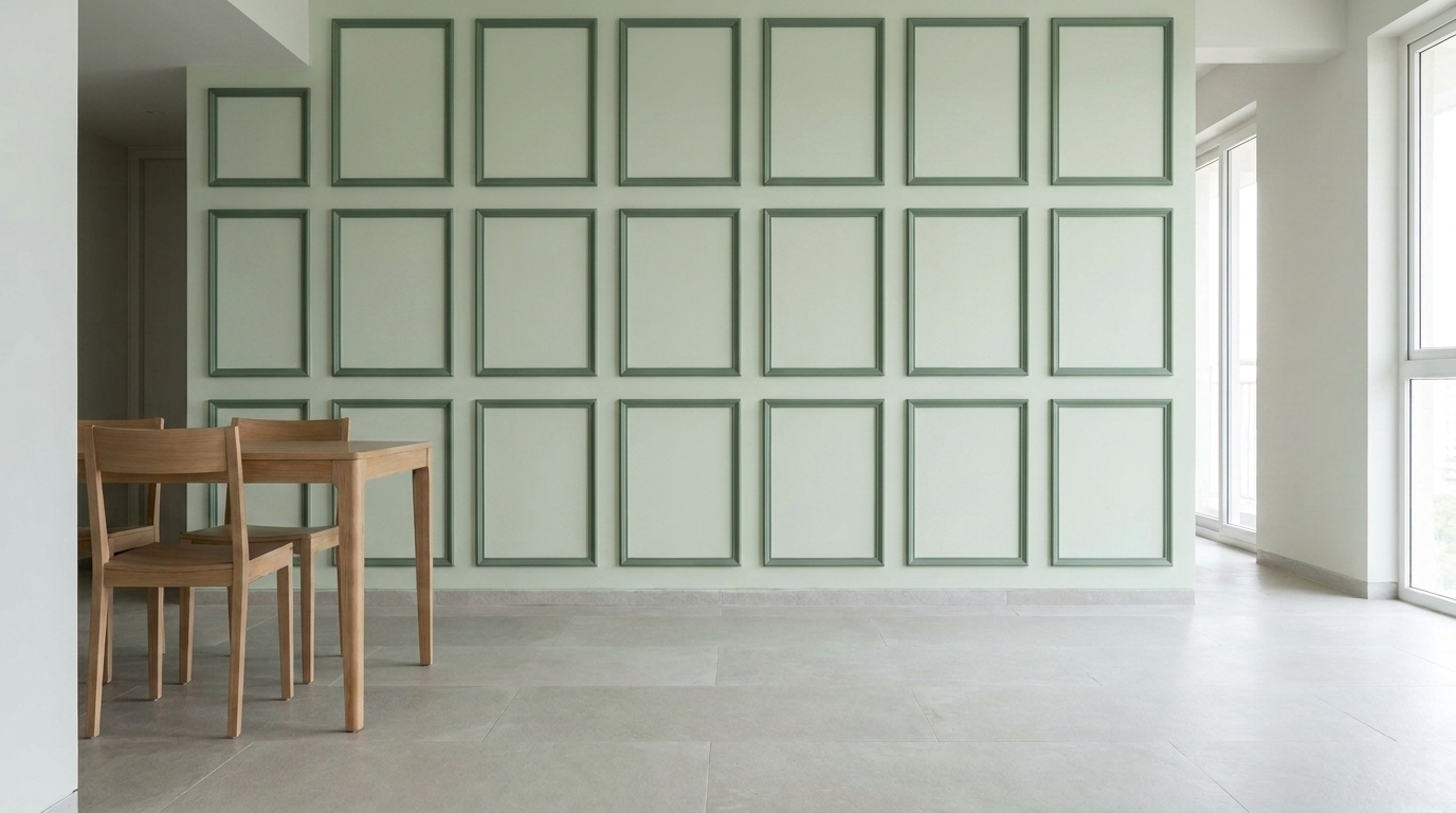
1.Panel Moulding (Rectangular Wall Panels)
Simple rectangular moulding panels, evenly spaced across a plain wall, are the easiest and least disruptive way to add architectural detail no colour change, no furniture move, no real construction. It's a subtle change on paper, but it's the difference between a wall that looks builder-grade and one that looks like someone actually designed the room.
The key is spacing consistency: panels should be evenly sized and evenly gapped, following the proportions of the wall rather than a fixed size copied from a reference photo. Paint the moulding the exact same colour as the wall (not a contrasting shade) so the detail comes from the shadow lines the raised trim casts, not from a colour block. This is one of the most budget-friendly moulding styles on this list and works in almost any room living rooms, hallways, even behind a headboard.
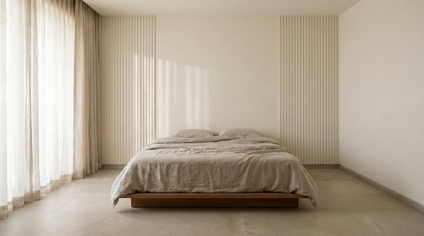
2.Fluted Pilaster Moulding
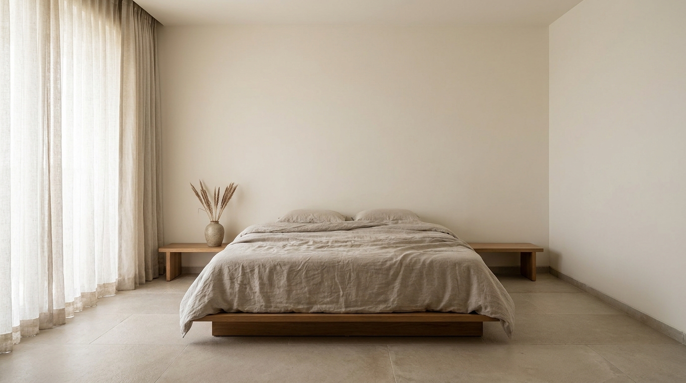
Vertical fluted pilasters thin column-like strips of moulding with ribbed vertical grooves work especially well flanking a doorway, a TV unit, or a bed headboard. Where panel moulding adds texture across a flat surface, pilasters do something different: they add height and rhythm, drawing the eye upward in a way that makes a room feel taller than it measures.
They're most effective in pairs, symmetrically placed either side of a focal point, rather than scattered across a wall. In a bedroom, flanking the headboard turns a plain bed wall into something that reads almost like built-in architecture. The ribbed texture also catches side light beautifully even a single window's natural light will trace fine shadow lines down each groove, which is part of why this style photographs so well for both real estate listings and social content.
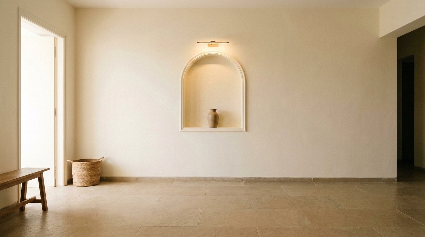
3.Arched Niche Moulding
An arched niche built into a flat wall even a shallow, non-structural one that projects only a few inches creates a natural spot to display a single object without needing an actual shelf or console table taking up floor space. It's especially effective in entryways, dining walls, and awkward narrow corridors where furniture doesn't fit but a wall detail does.
What makes this style work is restraint: one niche, one object, done. Overfilling it with multiple items defeats the purpose the arch itself is the decoration, and whatever sits inside should feel deliberately chosen rather than displayed for the sake of filling space. Adding a small picture light above the niche extends its impact into the evening, turning a daytime detail into something that still reads as designed after dark.
4.Picture Frame Moulding Grid
A grid of thin picture-frame-style moulding rectangles across a wall without any actual pictures inside them reads as quiet, architectural detail rather than decor. It's a popular move for dining and living room feature walls specifically because it doesn't compete with anything else happening in the room no art to coordinate with, no colour clash to manage.
The trick to making this style look intentional rather than accidental is tonal contrast without colour contrast: painting the moulding a slightly deeper or lighter tone of the same base colour as the wall, rather than a completely different hue. This keeps the grid feeling architectural instead of decorative. It's also one of the more forgiving moulding styles to retrofit later if you're not ready to commit to art or a gallery wall yet, empty frame moulding gives the wall presence in the meantime.
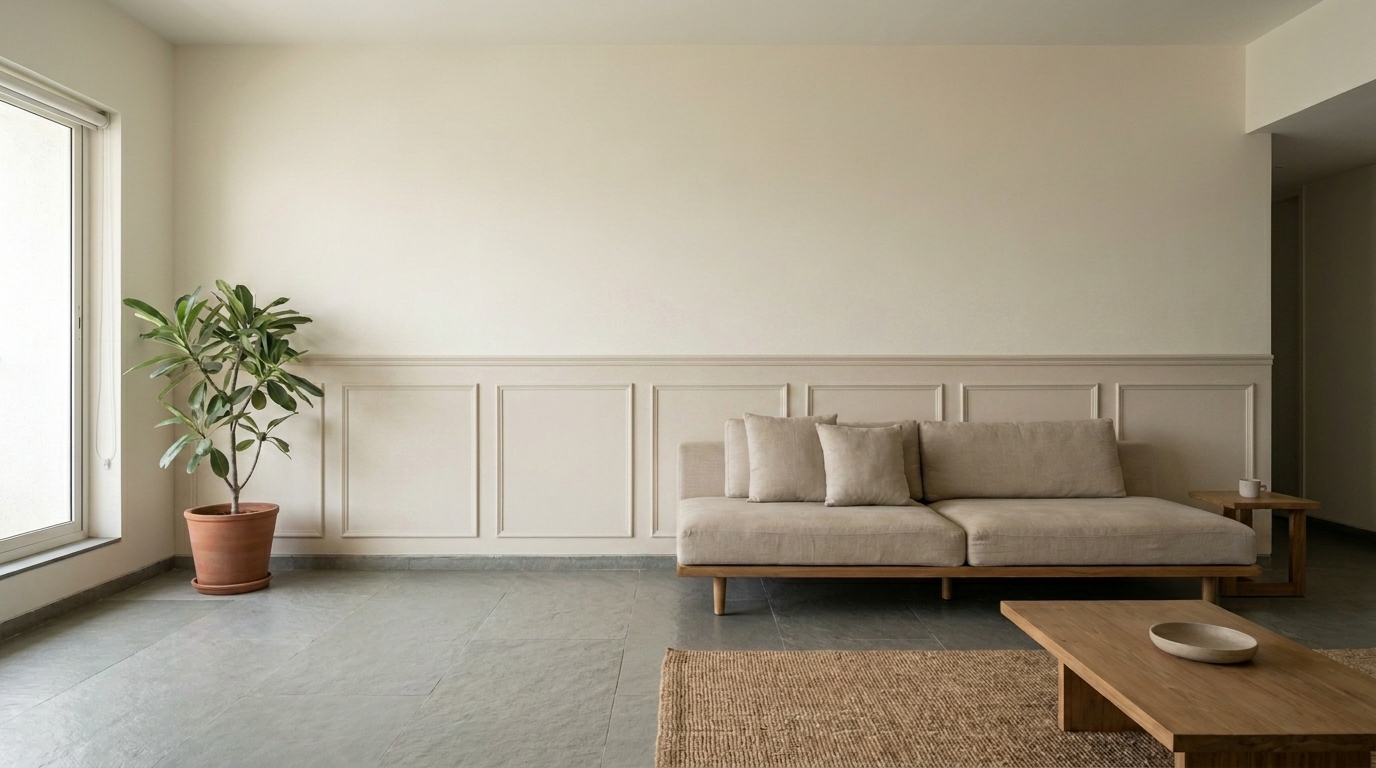
5.Wainscoting (Half-Wall Panel Moulding)
Wainscoting panel moulding that covers only the lower half of a wall, capped with a horizontal rail adds a classic, tactile layer to a room while doing something genuinely practical: it protects the lower wall from scuffs, chair marks, and everyday wear near seating and dining areas, which is exactly the zone that takes the most damage in a lived-in Indian home.
Where the rail sits matters more than people expect align it roughly with the top of the sofa back or chair rail height, so the moulding visually "supports" the furniture line rather than cutting across it randomly. Above the rail, the wall usually stays as plain flat paint, creating a clean two-zone look: detailed below, calm above. This contrast is part of what makes wainscoting feel deliberate rather than half-finished.
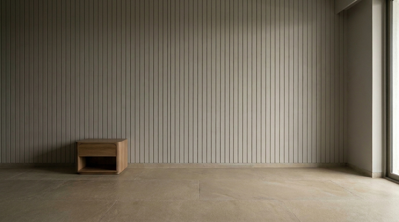
6.Ceiling-to-Floor Vertical Batten Moulding
Thin vertical battens running the full height of a wall evenly spaced, floor to ceiling create a rhythm that makes low-ceilinged Indian apartment rooms feel noticeably taller than they actually measure. It's one of the most requested moulding styles going into 2026, particularly for bedroom and living room feature walls in newer, more compact apartment layouts where ceiling height is often a real constraint.
Spacing is everything here battens spaced too widely lose the vertical rhythm effect and start looking like isolated strips rather than a considered pattern; spaced correctly (usually every 6-8 inches, adjusted to wall width), they create a continuous upward pull that genuinely changes how tall the room feels standing in it, not just in photos. This style also pairs well with a slightly darker or moodier paint colour than most moulding styles, since the vertical lines keep the wall from feeling heavy even in a deeper tone.
Want a real estimate for your home?
Share your home in 2 minutes. We'll match you with verified designers in your city and give you a BOQ-level estimate before any work begins.
Share your home →