The Modern Wardrobe Isn't Just Storage
Six shifts that turn a wall of shutters into a piece of furniture worth designing around.
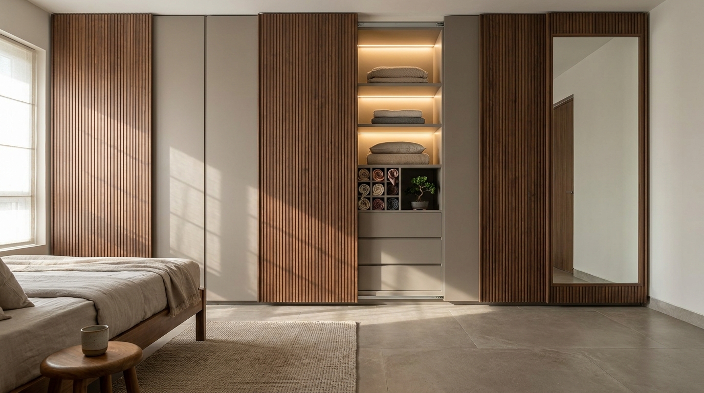
Wardrobes in most Indian homes are still designed the way they were fifteen years ago a wall of shutters and a promise of "maximum storage." But the wardrobe has quietly become one of the most requested redesign items in 2026 briefs, because people have realized storage isn't the only thing it needs to do. Here's what a genuinely modern wardrobe looks like, point by point.
1. Full-Height Sliding Wardrobes Instead of Hinged Shutters
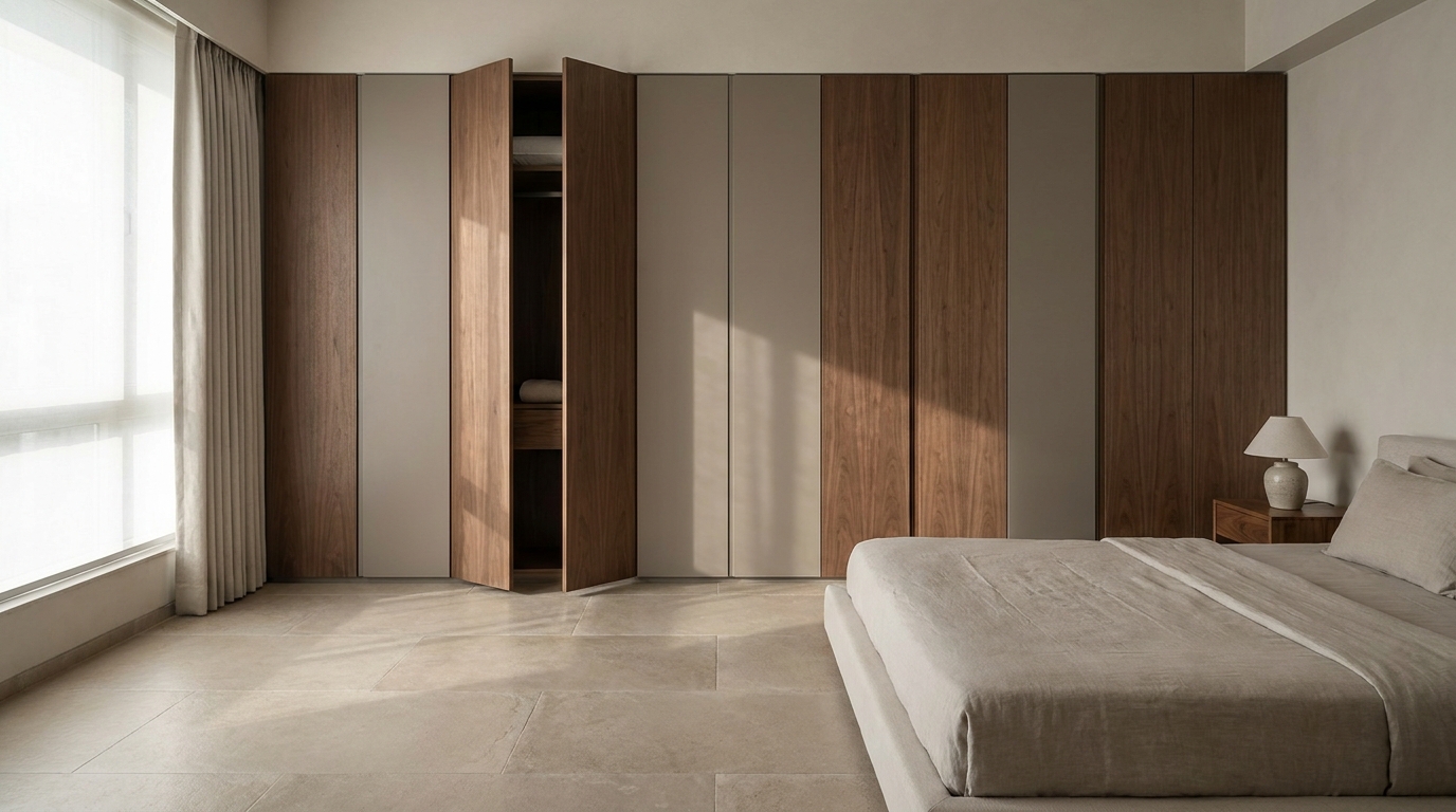
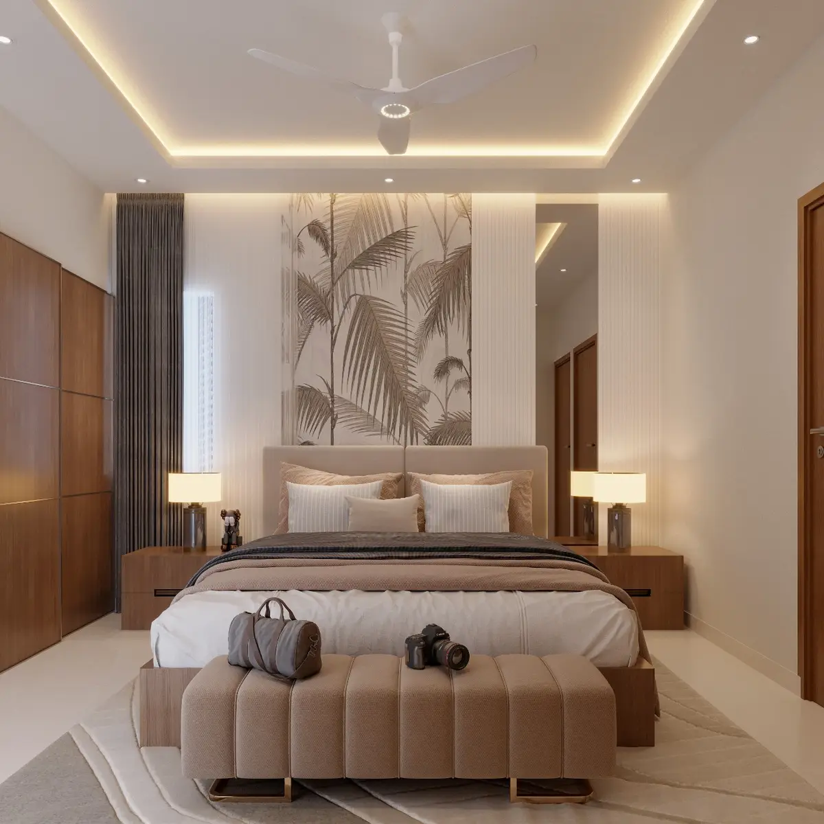
Hinged wardrobe doors need swing clearance space that's often unavailable in smaller Indian bedrooms, and space that, even when available, sits unused 90% of the time. Full-height sliding shutters solve this by eliminating the swing radius entirely, which means furniture can be placed closer to the wardrobe wall without ever blocking access.
Beyond the space saving, sliding shutters read as more current simply because they don't visually "open into" the room the wardrobe wall stays flat and continuous even when closed, which is a big part of why modern bedrooms look calmer than older ones with a wall of hinged panels.
2. Mixed Material Shutters Instead of a Single Laminate
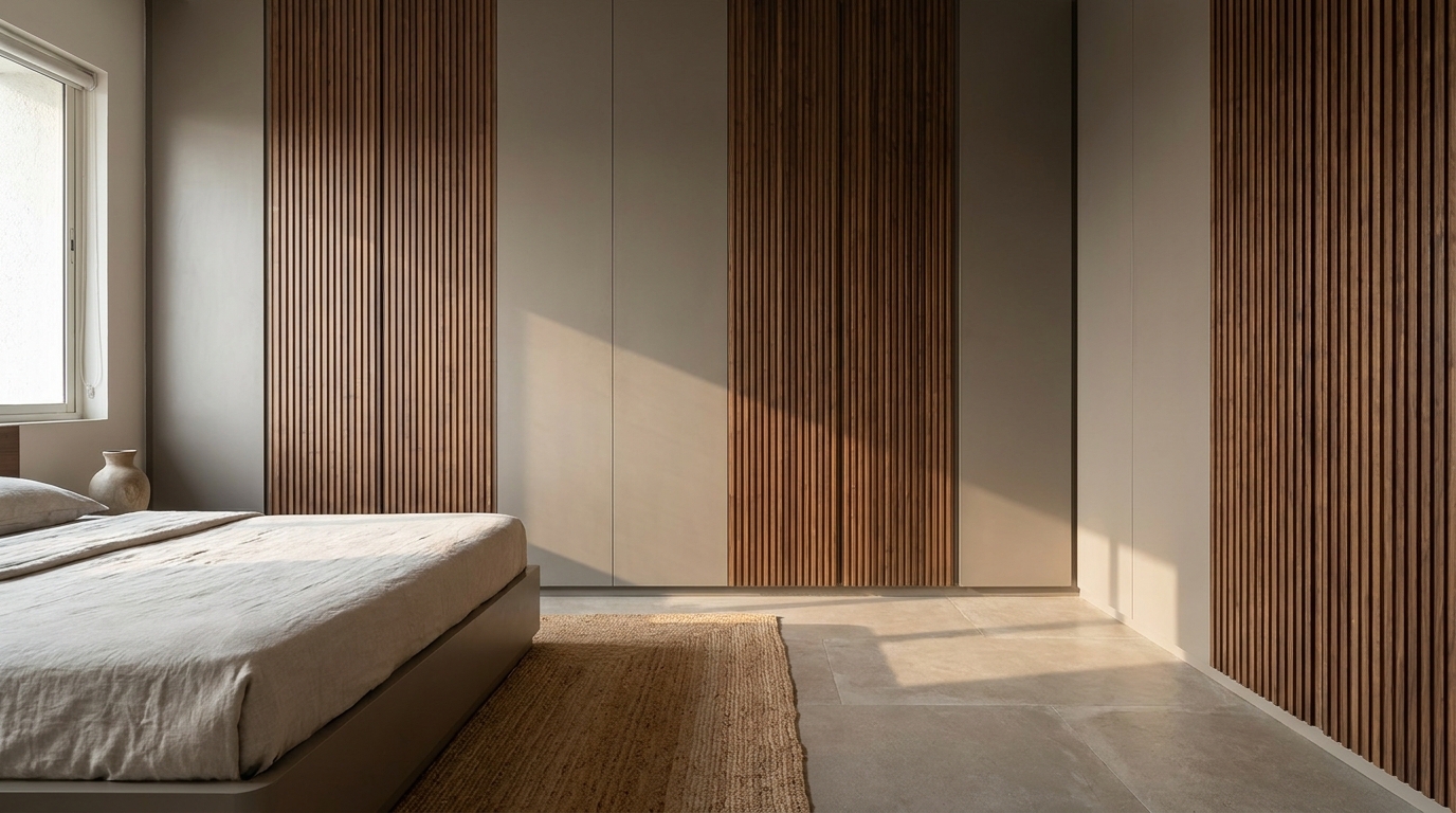
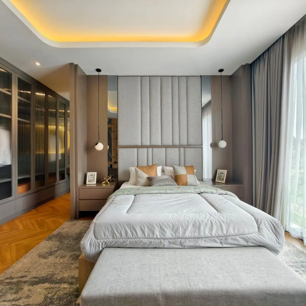
The single biggest visual upgrade in modern wardrobe design isn't more storage it's mixing two materials on the shutter face instead of one uniform laminate across the entire wall. A fluted wood panel paired with a matte lacquer section, or a woven cane insert next to a solid panel, breaks up what would otherwise be a flat, monotonous wall.
This doesn't need to be expensive even alternating two shutter finishes across an otherwise identical wardrobe structure creates enough visual rhythm to make the whole wall feel considered rather than just functional.
3. Internal Lighting That Turns On When You Open It
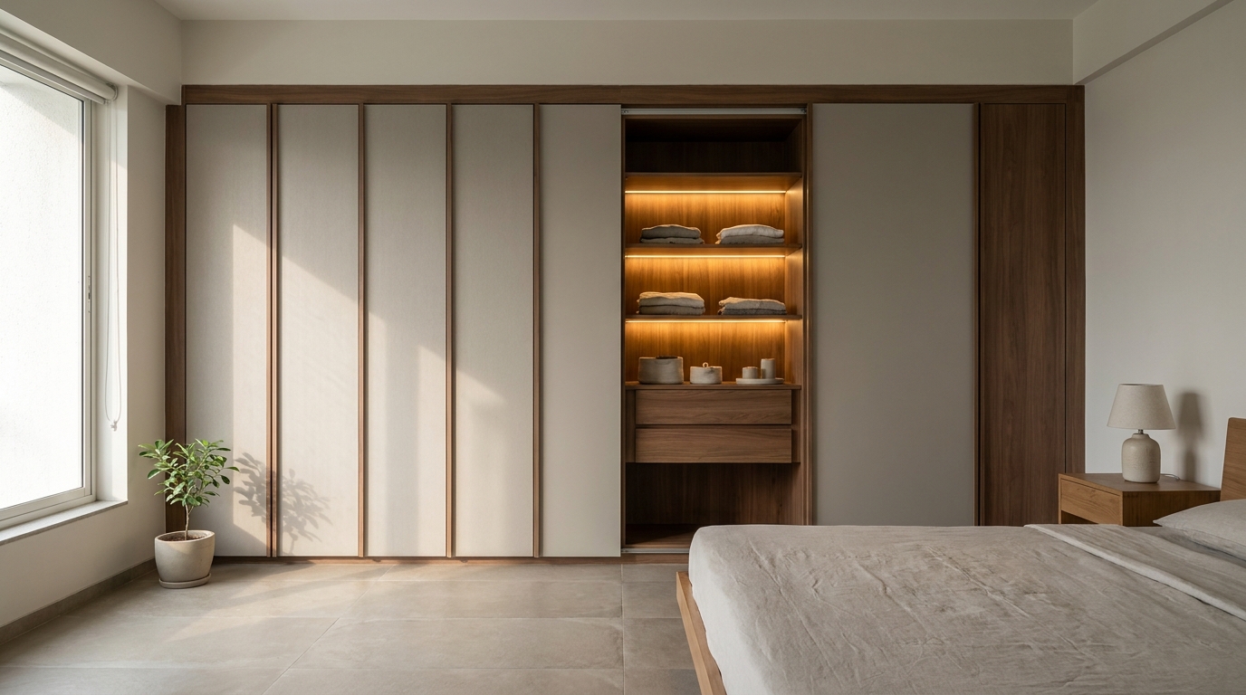
A wardrobe that goes dark the moment the door closes is a design oversight most people don't notice until they're standing in front of it at 7am trying to find a matching shirt by phone flashlight. Motion-sensor LED strips along the internal shelving warm white, not cool solve this completely, and they're inexpensive enough now that there's little reason to skip them.
This is one of those details that doesn't show up in "wardrobe inspiration" photos nearly as often as it should, but it's consistently one of the most-appreciated additions once people actually live with it.
4. Open Display Sections for the Things Worth Showing
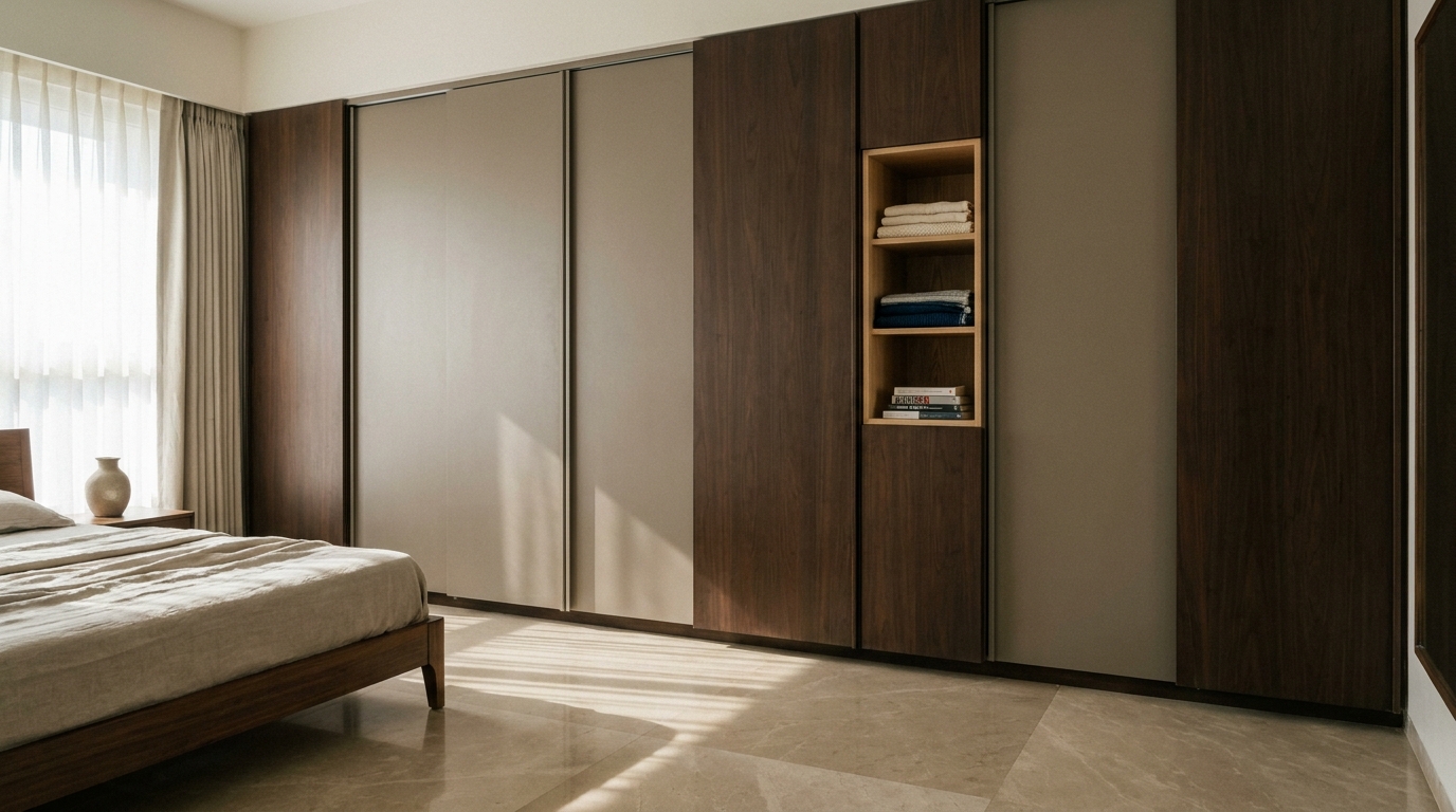
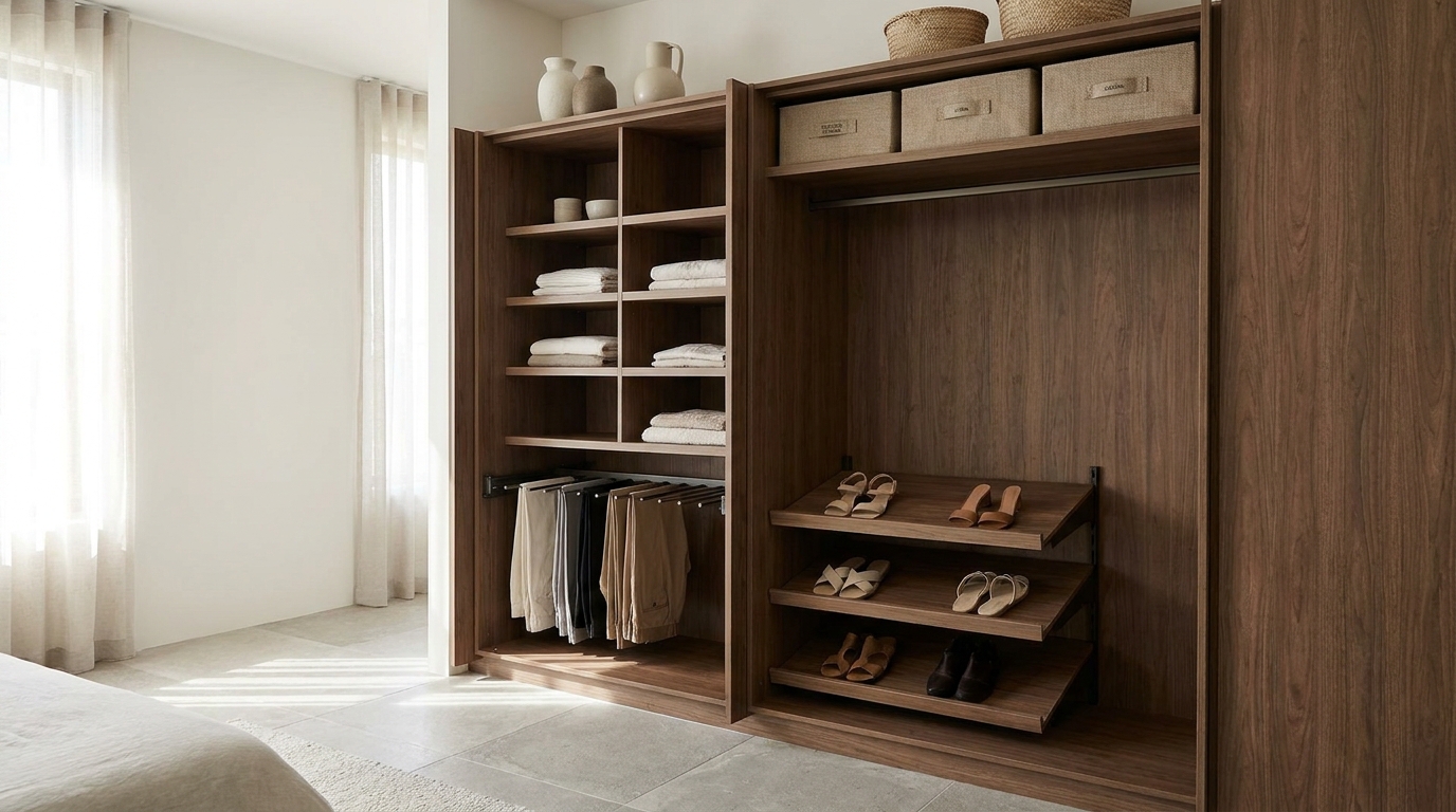
Not everything needs to be hidden behind a shutter. A small open shelving section even just two or three cubbies gives space for folded scarves, a stack of books, or a styled tray, and it breaks up what would otherwise be an unbroken wall of closed storage. It also makes the wardrobe feel more like furniture and less like a utility box.
The key is restraint: one open section, styled deliberately, does far more for the room than several open shelves that end up cluttered within a month.
5. A Dedicated Zone for Accessories, Not a Drawer That Catches Everything
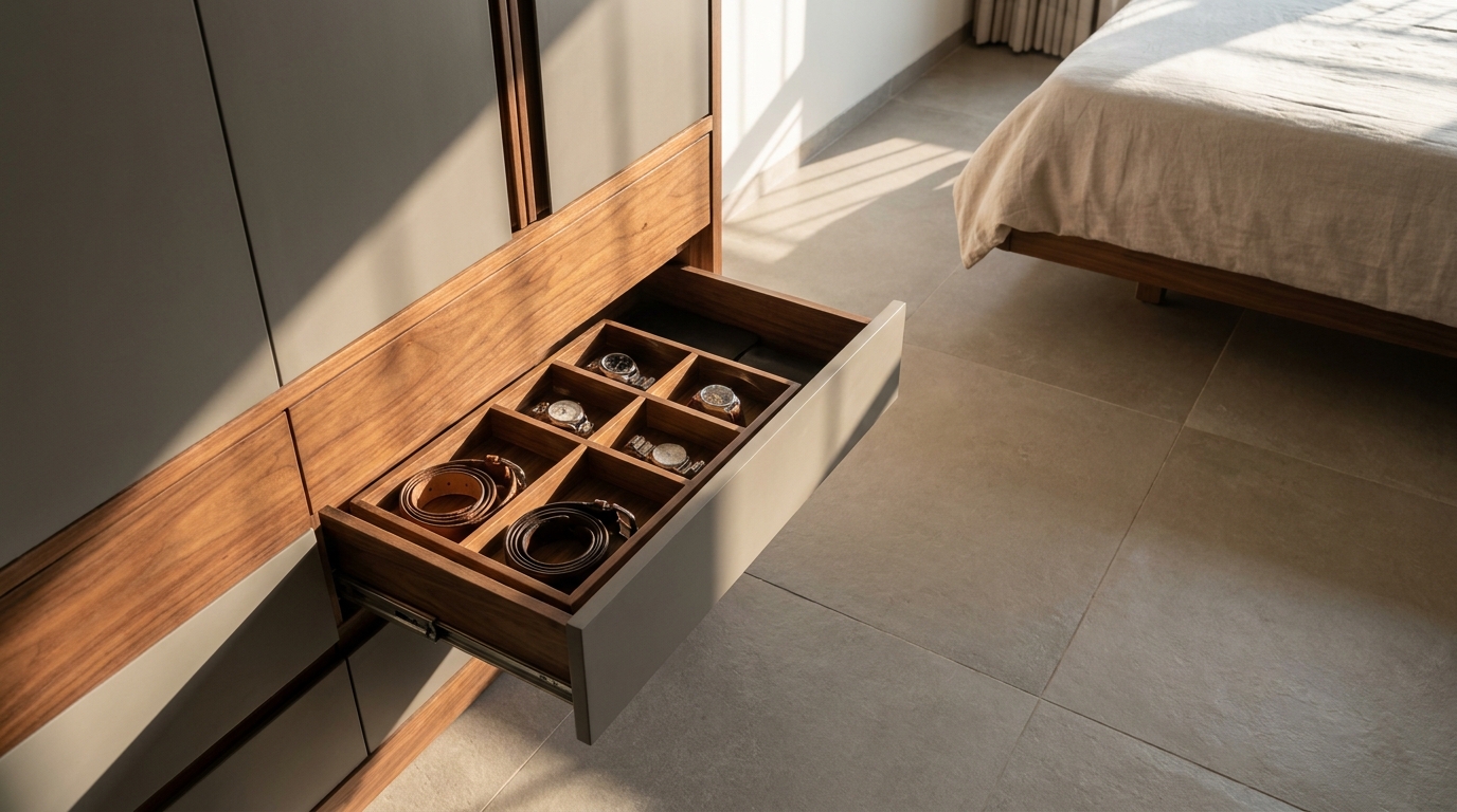
Watches, jewelry, belts, ties in most wardrobes, these end up in a single miscellaneous drawer that becomes impossible to actually use. A shallow, divided accessory tray or a small pull-out unit built specifically for these items keeps them visible and untangled, and it's a detail that makes the wardrobe feel custom-built rather than off-the-shelf.
This zone works best positioned at a height that doesn't require bending or reaching roughly waist height — since it's usually accessed daily.
6. A Full-Length Mirror Built Into the Wardrobe, Not Propped Against a Wall
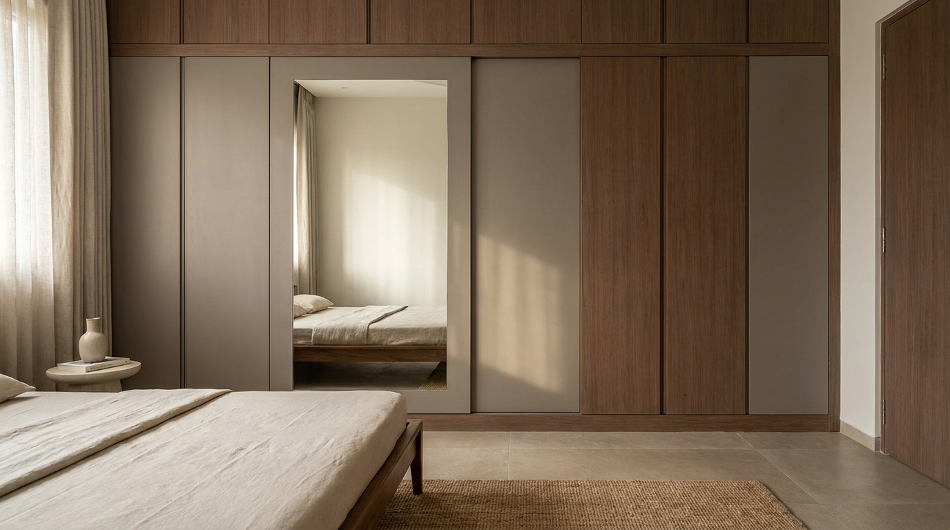
A free-standing mirror leaning against a wall is one of the clearest signs a bedroom wasn't fully planned. Building a full-length mirror directly into one wardrobe shutter either as a sliding panel or a fixed inset removes the need for a separate piece of furniture entirely and keeps the room's floor space clear.
It's a small integration, but it's often the single detail that makes a wardrobe wall feel finished rather than assembled.
The Real Shift
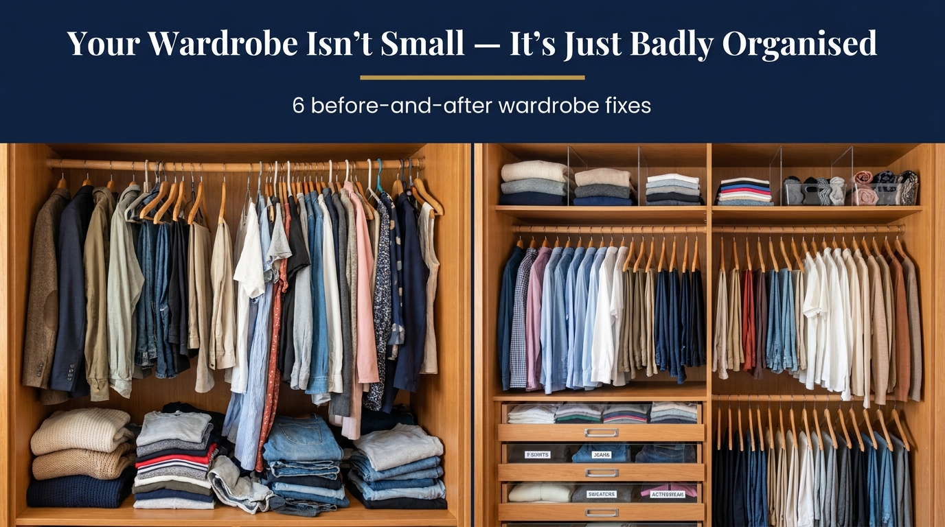
None of these six changes are about adding more storage they're about making the storage that already exists work better and look considered. A modern wardrobe isn't defined by how much it holds; it's defined by how little friction there is in using it every day.
Want a real estimate for your home?
Share your home in 2 minutes. We'll match you with verified designers in your city and give you a BOQ-level estimate before any work begins.
Share your home →