12 Living Room Layouts That Actually Work in Indian Apartments
12 layout ideas that solve for awkward corners, narrow rooms, low ceilings, and everything in between.
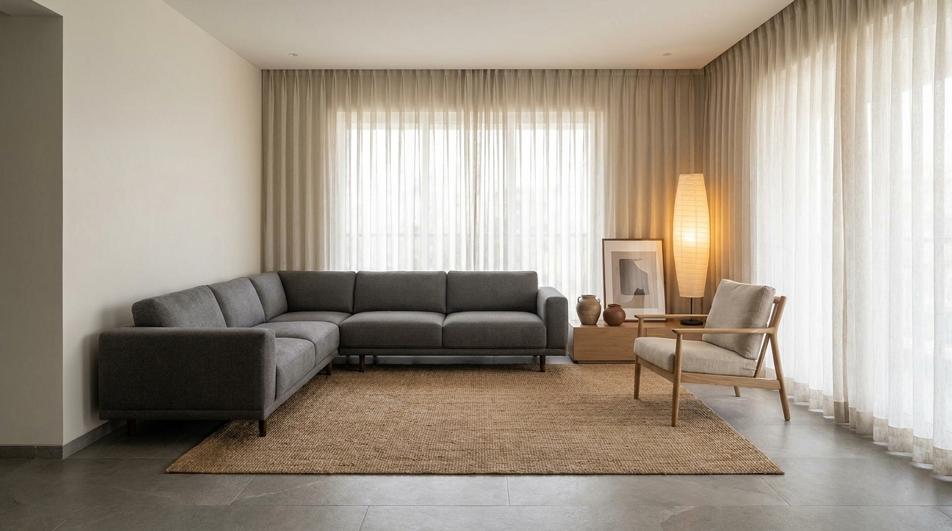
Most living room layouts in Indian apartments default to "sofa against one wall, TV against the opposite wall" not because it's the best option, but because it's the first one anyone tries. Here are 12 layouts that solve for different room shapes, family needs, and space constraints.
1. The L-Shaped Anchor
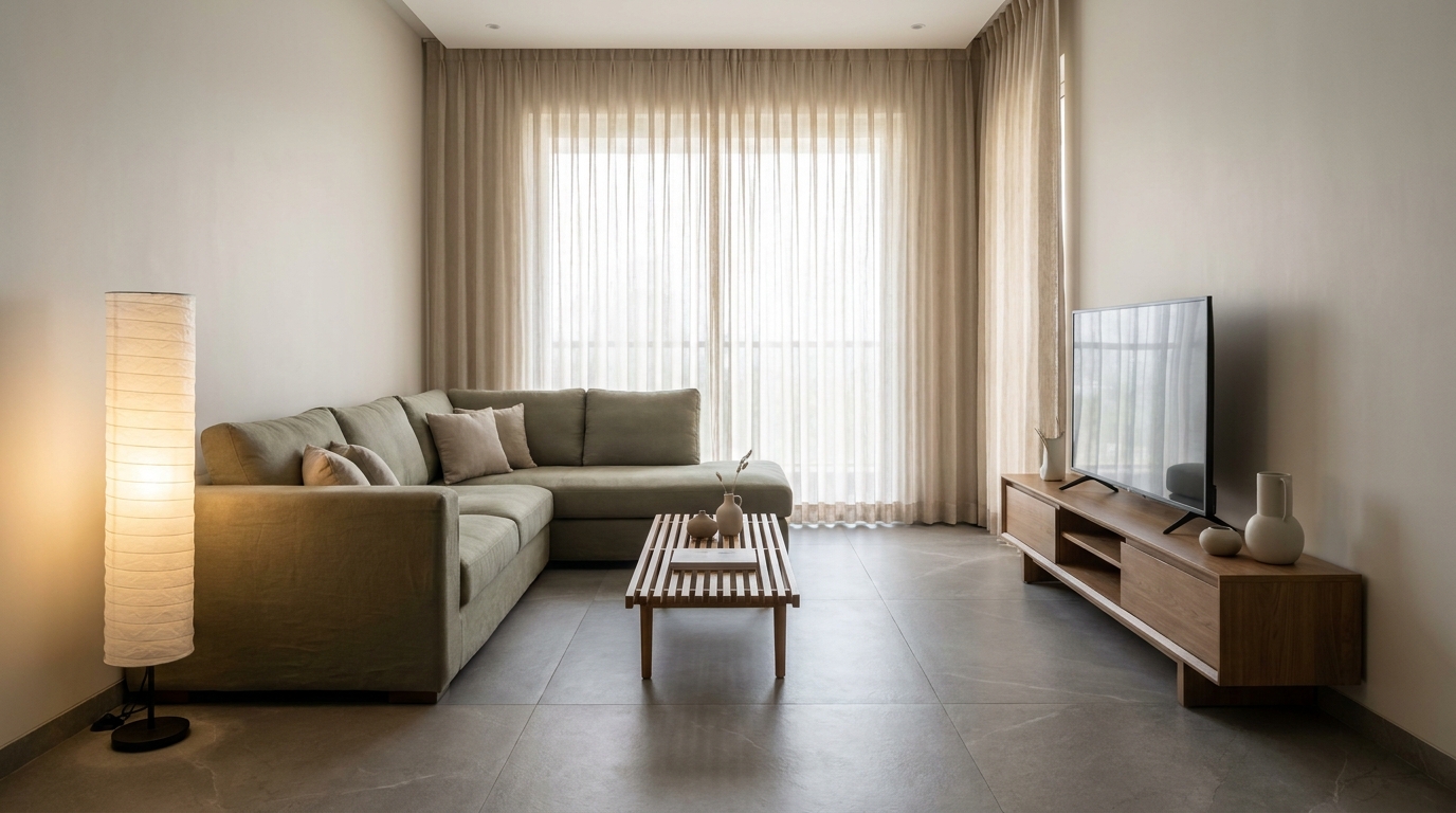
An L-shaped sofa tucked into one corner frees up the rest of the room for movement and works especially well in squarish living rooms where a straight sofa would leave awkward leftover space on either side. Because the L-shape naturally hugs a corner, it also solves a problem most straight sofas create in Indian apartments the dead zone that forms behind a sofa placed mid-wall in a room that isn't quite big enough to walk all the way around it.
The chaise end of the L is worth thinking about deliberately: facing it toward a window gives you a daytime lounging spot with natural light, while facing it toward the TV prioritizes screen-watching comfort. Either way, this layout tends to work best in rooms of at least 130-140 sq ft, since a shorter L can start to feel like it's swallowing the room rather than anchoring it.
2. Floating Furniture Away From the Walls
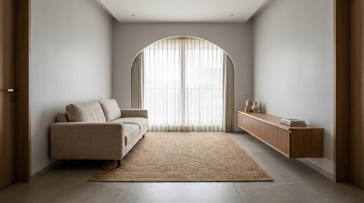
Pulling the sofa and console a foot or two off the walls, rather than pushing everything to the edges, makes even a small room feel more like a designed space than a waiting room it creates a sense of a defined "seating zone" instead of furniture just lining the perimeter. This is one of the more counterintuitive layout moves, since the instinct in a small room is almost always to push everything back to maximize open floor space, but the opposite often reads better visually.
The trick is committing fully — floating a sofa 6 inches off the wall looks like a mistake, while floating it 18-24 inches off creates an intentional gap the eye reads as a boundary. If floor space genuinely doesn't allow for that gap on all sides, even floating just the primary seating piece while keeping secondary furniture wall-adjacent gives some of the same effect.
3. Two-Seater Facing Setup for Conversation
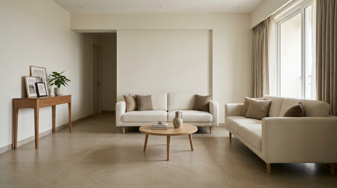
Instead of one large sofa facing a TV, two smaller two-seaters facing each other across a coffee table prioritizes conversation over screen-watching a layout that works particularly well for households that entertain often, or for families where the living room doubles as a space for guests rather than purely daily lounging.
This setup does require a slightly more deliberate approach to the TV, since it's no longer the automatic focal point. Positioning it to the side, on a swivel mount, or even inside a cabinet that closes when not in use, keeps the room feeling conversation-first rather than like a compromise between two competing layouts. It's also a layout that tends to photograph and feel more "finished" for hosting, since guests naturally face each other rather than sitting in a row.
4. The Narrow Room Fix Furniture Along One Long Wall
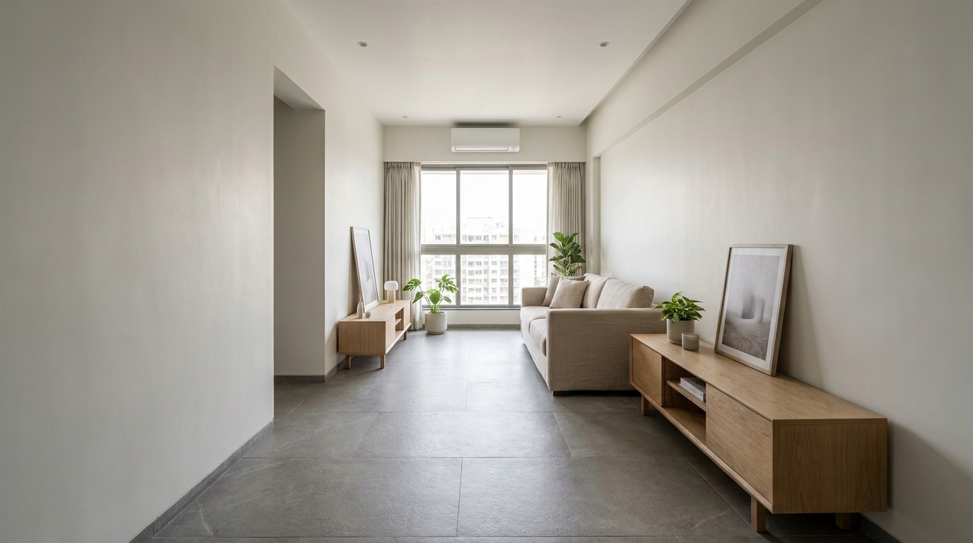
In long, narrow living rooms (common in older Indian apartment layouts), placing all major furniture along one long wall instead of spreading it across both keeps a clear walking path down the room's length, avoiding the cramped bottleneck a symmetric layout creates. This is one of the most common layout mistakes in narrow rooms trying to "balance" the room by putting the sofa on one wall and the TV unit on the opposite one, which technically uses the space but leaves almost no functional walking width down the middle.
Once everything sits on one wall, the opposite wall becomes valuable in a different way it can hold a slim console, wall art, or nothing at all, and either choice works, since the goal there is keeping the path clear rather than filling it with more furniture. This layout also tends to make narrow rooms feel more intentional in photos, since the eye isn't bouncing between two competing sides.
5. Rug-Defined Zones in an Open Living-Dining Space
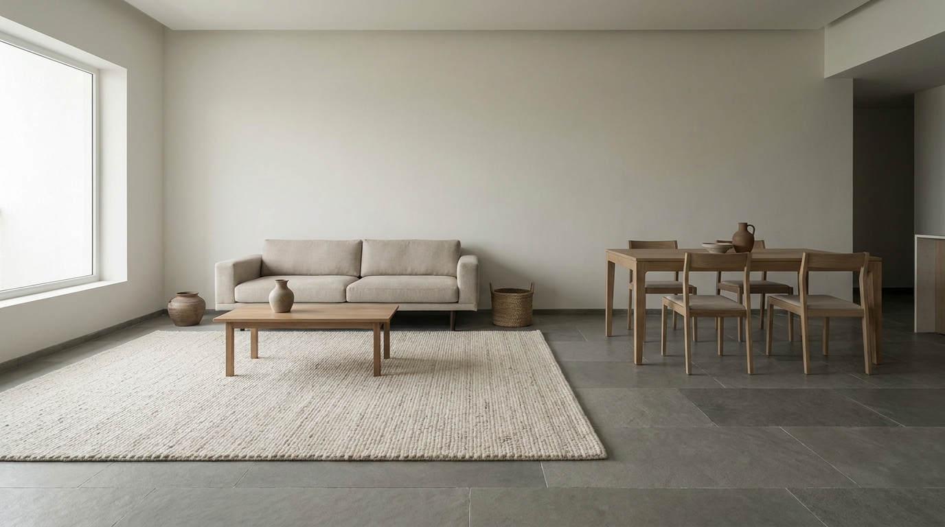
In open-plan living-dining layouts, a rug under just the seating area not the whole floor visually separates the living zone from the dining zone without needing a wall or partition. This is especially useful in newer Indian apartment layouts where living and dining are increasingly combined into one continuous space with no structural division at all.
Sizing the rug correctly matters more than people expect: it should extend at least to the front legs of the sofa and any accompanying chairs, so the seating area reads as one connected zone rather than furniture floating disconnected on top of a rug that's too small. The unrugged dining area on bare flooring then creates a natural, low-cost visual boundary no construction, no partition, just a change in what's underfoot.
6. Diagonal Sofa Placement for Awkward Corners
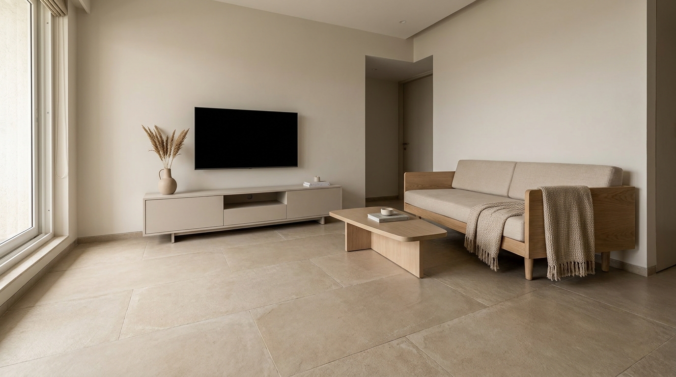
Placing a sofa at a 45-degree angle in a corner, rather than flush against the wall, can solve for an awkward room shape or an oddly placed window and it often makes a small room feel larger by breaking the boxy, right-angle default. Most Indian apartment living rooms are laid out with every piece of furniture at a 90-degree angle to the walls, and while that's the safest default, it's also the most predictable, which can make an already small room feel even more boxed in.
A diagonal placement works particularly well when a room has an awkward architectural feature in one corner a support column, an odd window placement, or an entry door that swings into the space since the angle can be used to work around the obstruction rather than fighting it with a straight layout. It's worth testing with painter's tape on the floor before committing, since the right angle is often more subtle than people expect even 30-45 degrees is usually enough.
7. Low-Profile Furniture for Low-Ceiling Rooms
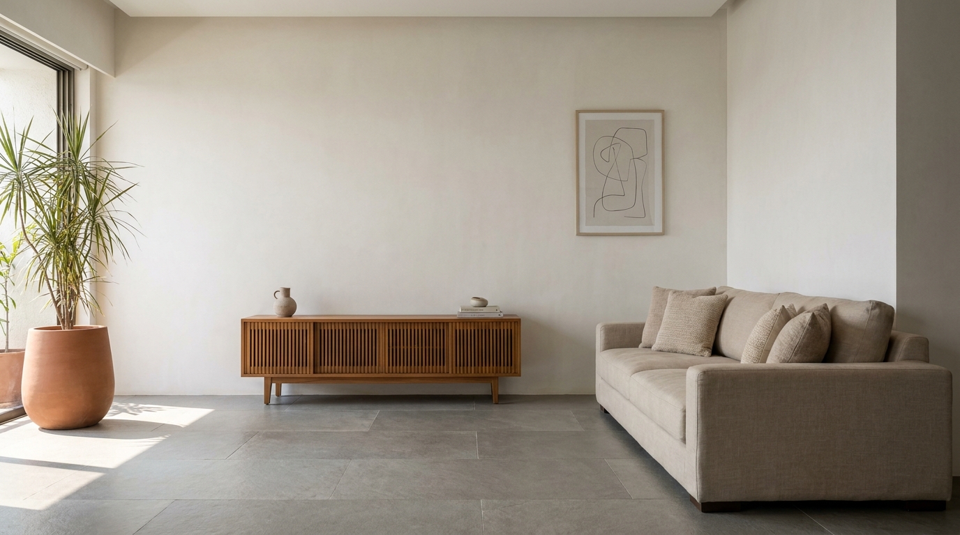
In apartments with lower ceiling heights, swapping tall-backed sofas and consoles for low-profile furniture (sofa back height under 75cm, console under 45cm) keeps more visual wall space open above the furniture line, making the ceiling feel higher by comparison. This is a layout principle that's often overlooked because low-ceiling rooms tend to get compensated for with lighting or paint choices, when the furniture proportions themselves are doing a lot of the work.
Pairing low-profile furniture with vertical elements elsewhere in the room a tall floor lamp, floor-to-ceiling curtains, or a single tall plant adds back some of the vertical interest that lower furniture removes, so the room doesn't end up feeling flat as a trade-off for feeling taller.
8. A Reading Corner Carved Out of a Larger Room
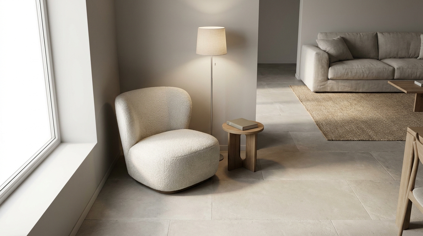
In larger living rooms, dedicating one corner to a single armchair, a floor lamp, and a small side table creates a secondary zone with its own purpose, instead of leaving the whole room as one undifferentiated seating area. This works especially well in living rooms over 180-200 sq ft, where a single sofa-and-TV grouping tends to leave noticeable unused space that ends up feeling empty rather than spacious.
The key to making this corner feel like its own zone rather than a stray chair is giving it a light source independent from the main room lighting a floor lamp specifically for that corner signals it's meant to be used on its own, even when the rest of the room's lights are off.
9. Modular Seating for Frequently Rearranged Rooms
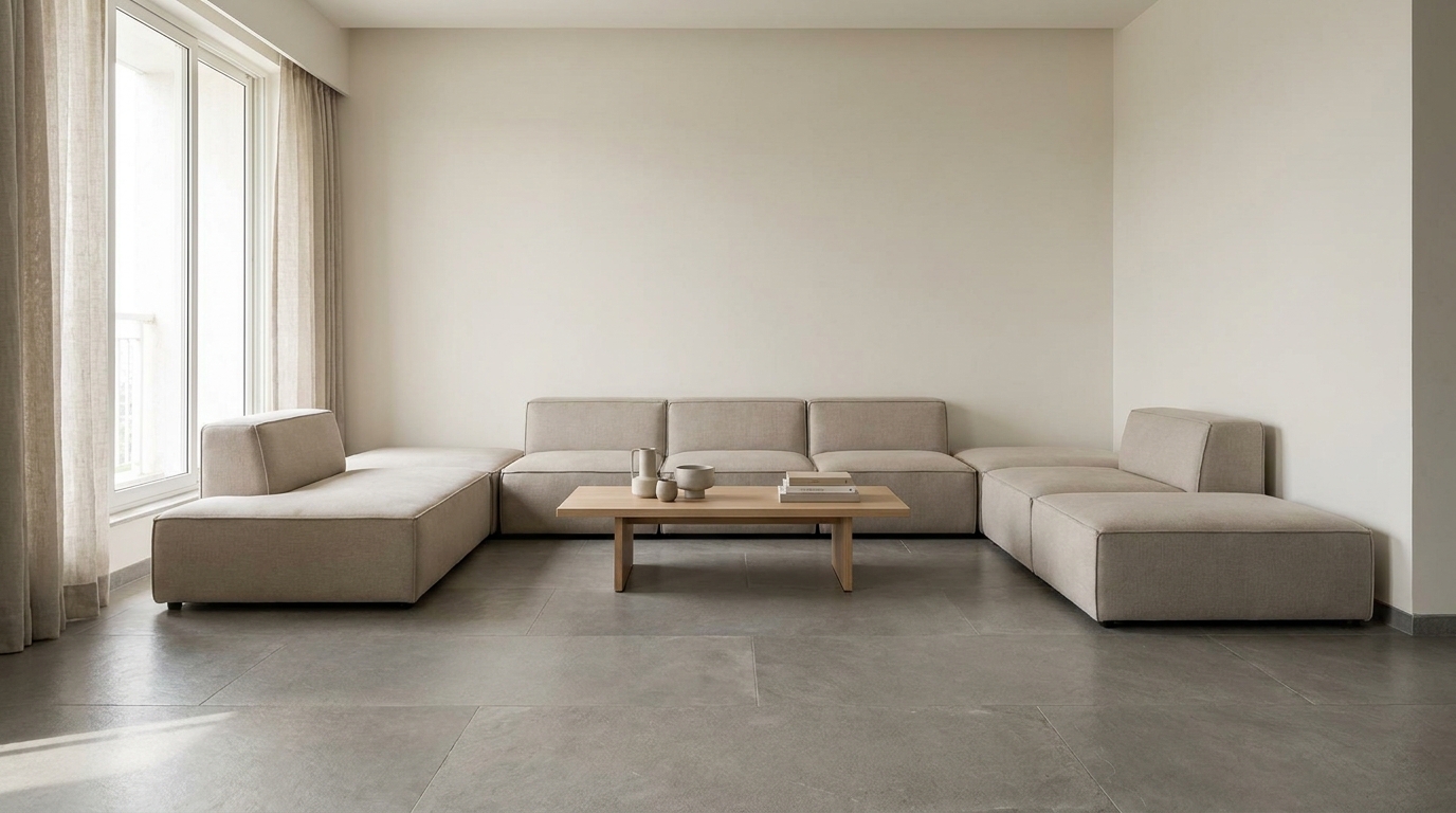
For households that regularly host or rearrange furniture, modular sofa sections that can be reconfigured split apart for more seats, pushed together for a compact layout offer more flexibility than a single fixed-shape sofa. This is particularly useful for smaller Indian households that use the living room for multiple purposes across the week: compact for everyday use, expanded when extended family visits.
The trade-off worth knowing upfront is that modular pieces typically cost more per seat than an equivalent fixed sofa, and the connection points between sections need to be checked carefully for stability if reconfiguring happens often. For households that genuinely will use the flexibility, though, it solves a real problem that a fixed sofa can't.
10. Console Table Behind the Sofa as a Room Divider
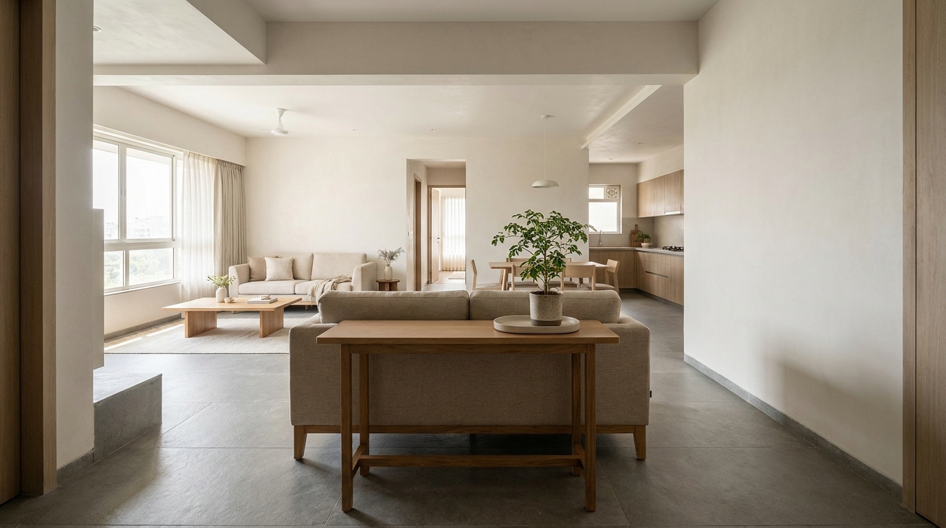
In open-plan homes, a console table placed directly behind the sofa (facing the entry) acts as an informal divider between the living room and the entry or hallway, without needing an actual partition wall. This layout move does double duty it gives the entry area a landing surface for keys and bags, while also giving the back of the sofa a "finished" side instead of an exposed fabric back facing the front door.
For this to work well, the sofa needs to sit with some clearance in front of it too, so the console doesn't end up crowding the seating area from behind. A console around 30-35cm deep is usually enough to create the visual boundary without eating significantly into either zone.
11. TV Off-Center to Prioritize a Window View
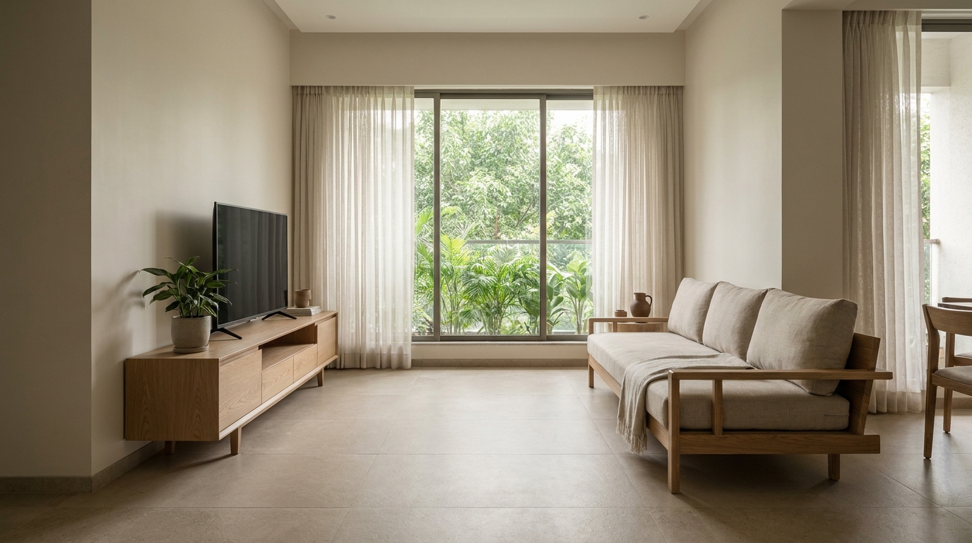
When a living room has a good window view, positioning the TV off-center or on a side wall (rather than directly opposite the seating) keeps the window as the visual focus instead of competing with the screen for attention. This is a layout choice that gets skipped surprisingly often, since "TV opposite sofa" is such a strong default that even rooms with genuinely good views end up planned around the screen instead.
A swivel TV mount is a practical middle ground here it lets the screen stay off-center as the default view but still turn to face the seating directly when actually watching something, so the layout doesn't force a real trade-off between the view and the TV.
12. A Bench Instead of a Second Sofa for Flexible Seating
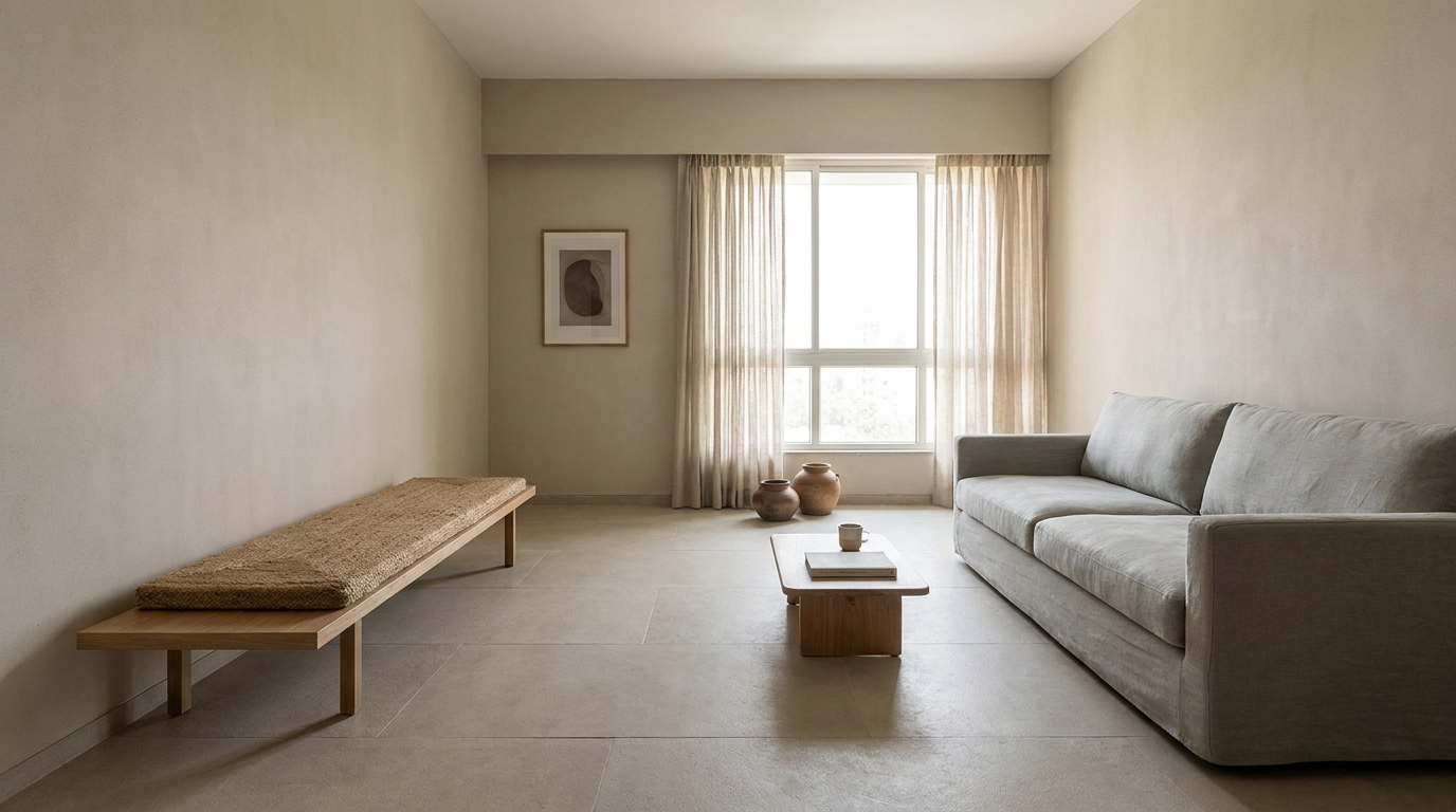
Replacing a second sofa or armchair with a simple bench along one wall gives flexible extra seating for guests without permanently committing that much floor space to fixed furniture the bench can also double as a surface for bags, books, or a folded throw day-to-day. A bench takes up meaningfully less visual and physical footprint than a second sofa or even a single armchair, which matters in mid-sized living rooms where a second major seating piece can start to feel like it's competing with the primary sofa.
This layout works particularly well positioned along a wall that would otherwise sit empty or become a dumping spot giving that wall a defined purpose (extra seating, a landing surface) tends to keep it tidier by default than leaving it as unclaimed space.
Want a real estimate for your home?
Share your home in 2 minutes. We'll match you with verified designers in your city and give you a BOQ-level estimate before any work begins.
Share your home →